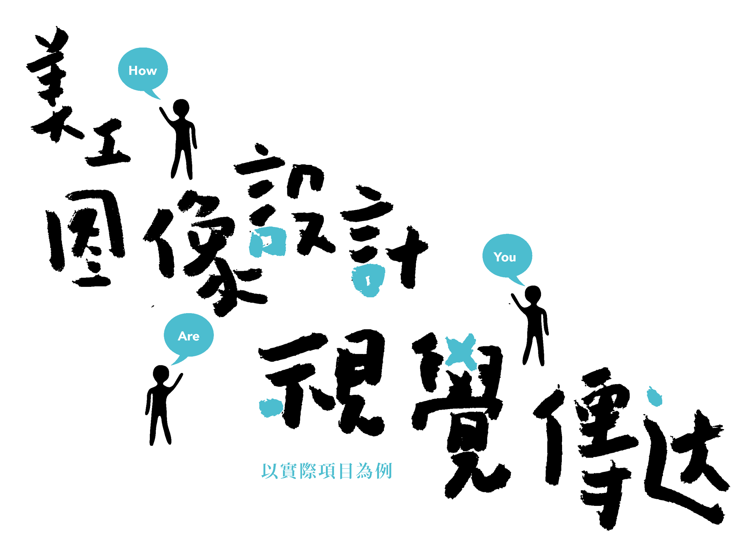
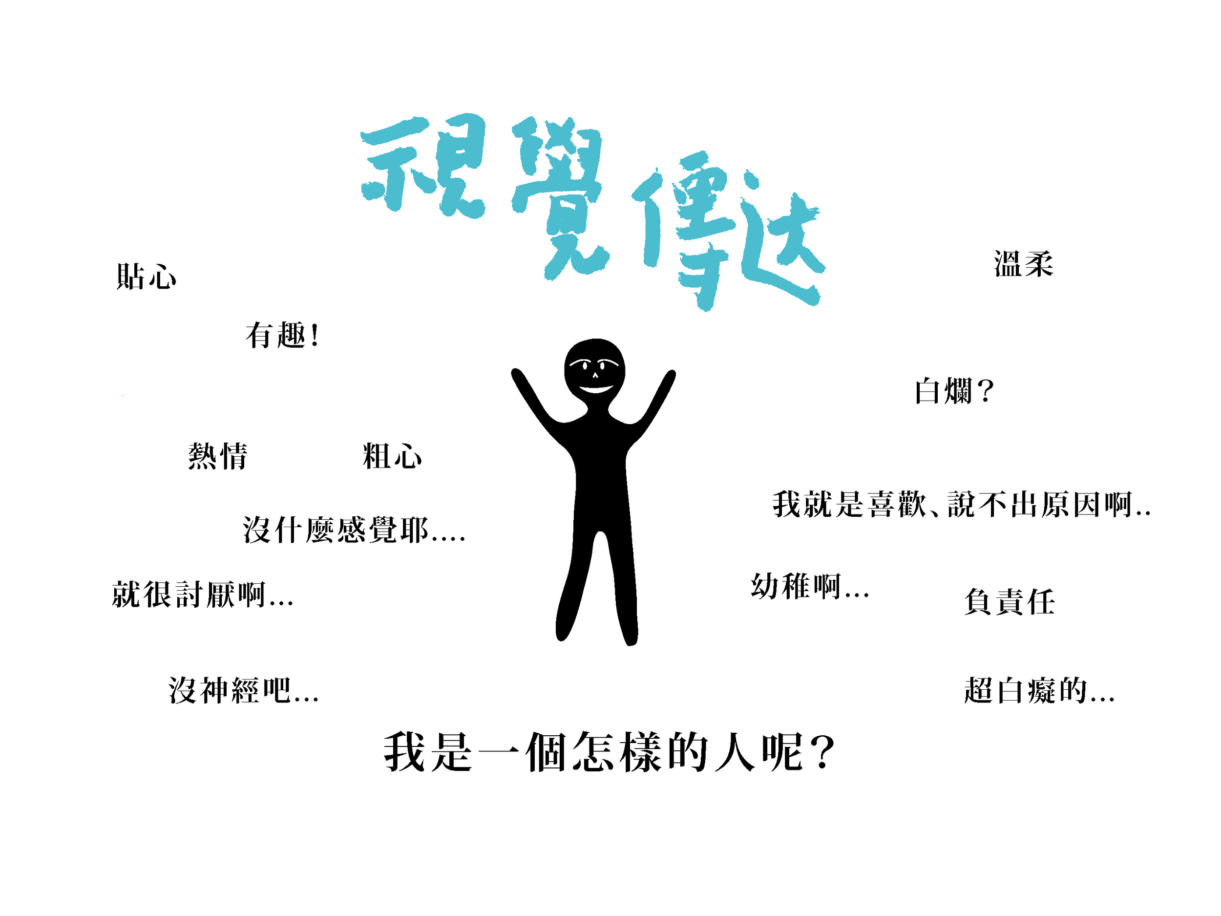
Before examining the nature of visual design, it is necessary to distinguish three concepts that are frequently conflated: artistry, graphic design, and visual communication. These are not simply different names for the same activity; they represent three distinct levels of design engagement, each operating at a fundamentally different depth.
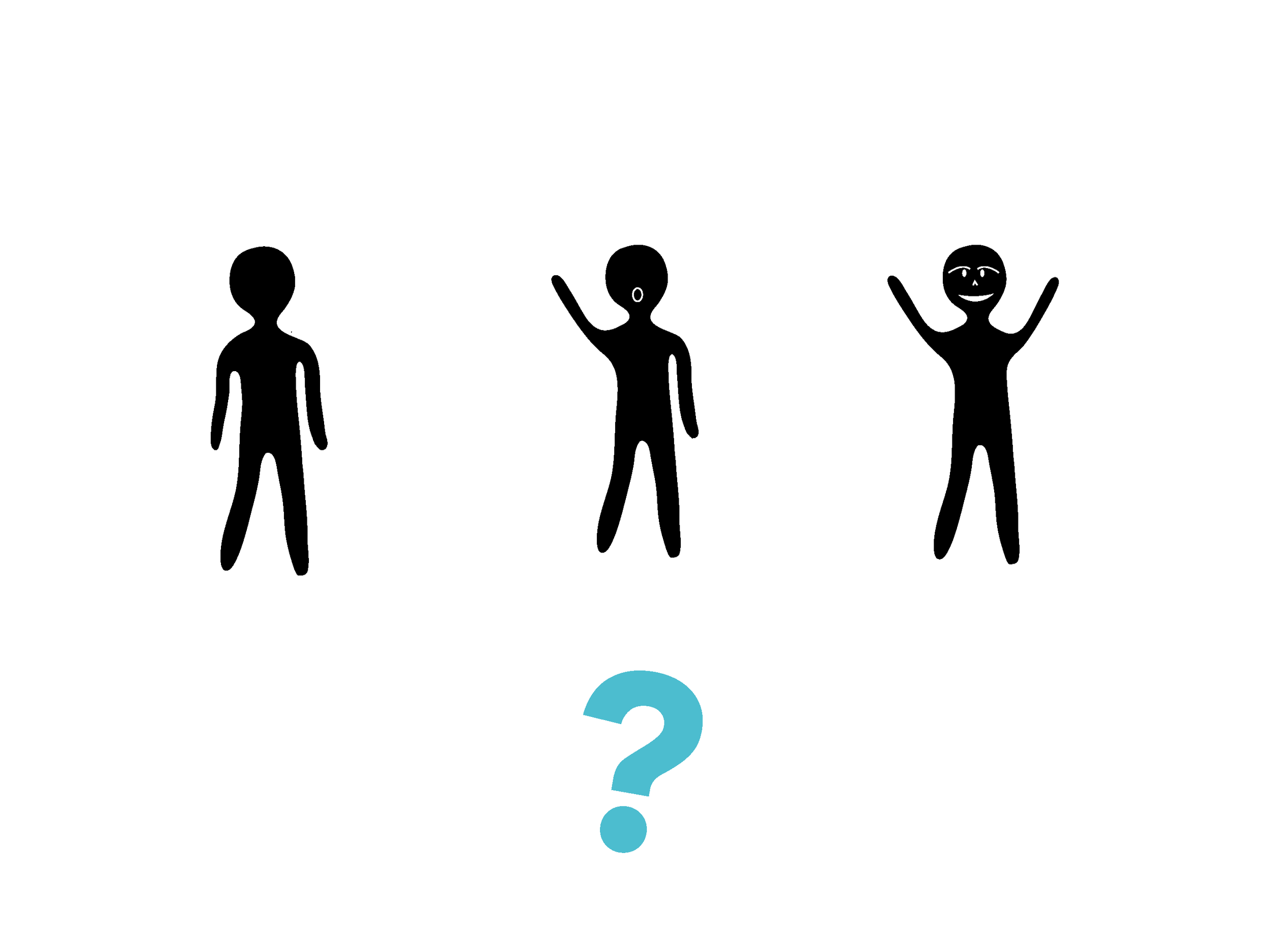
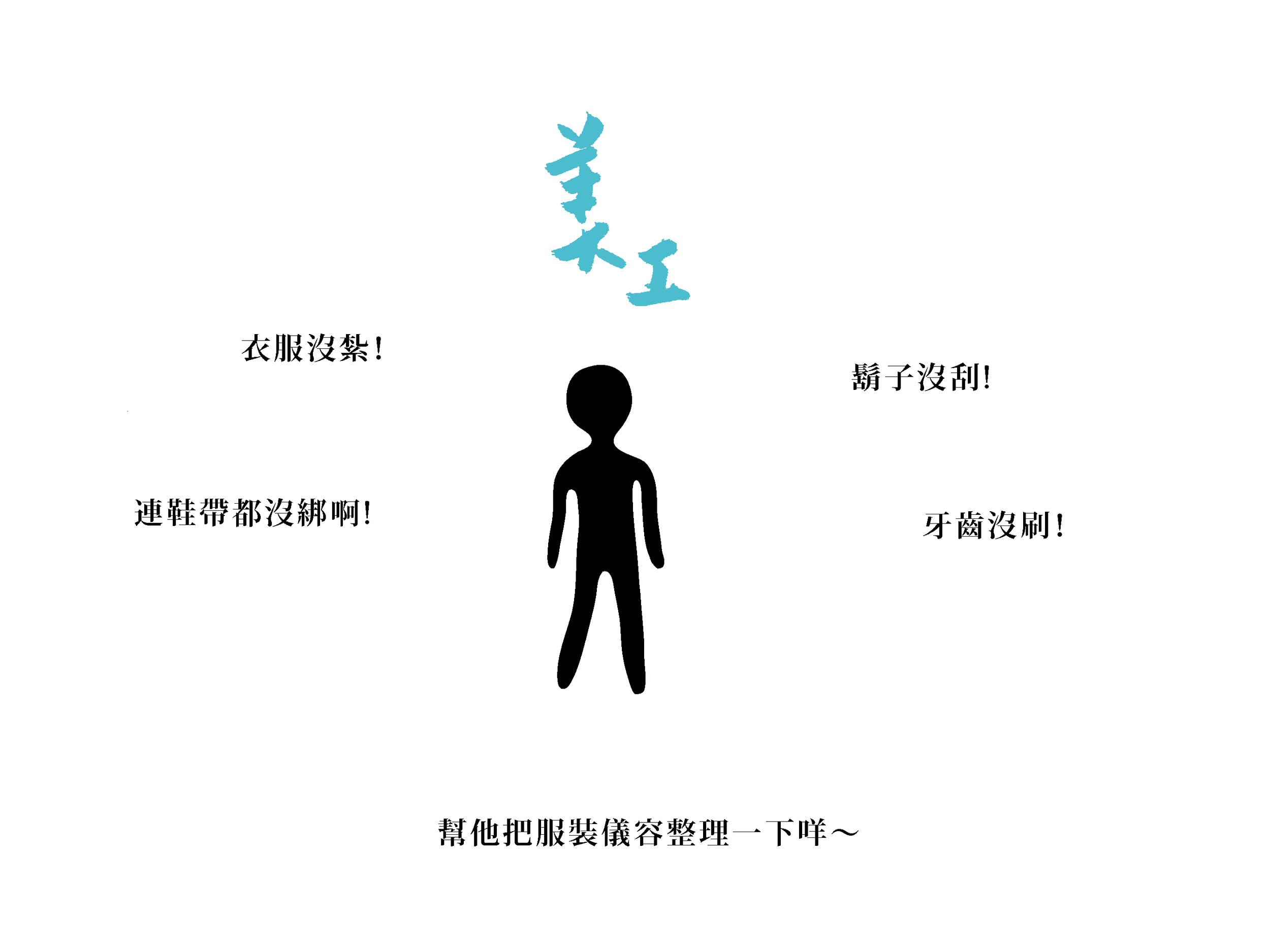
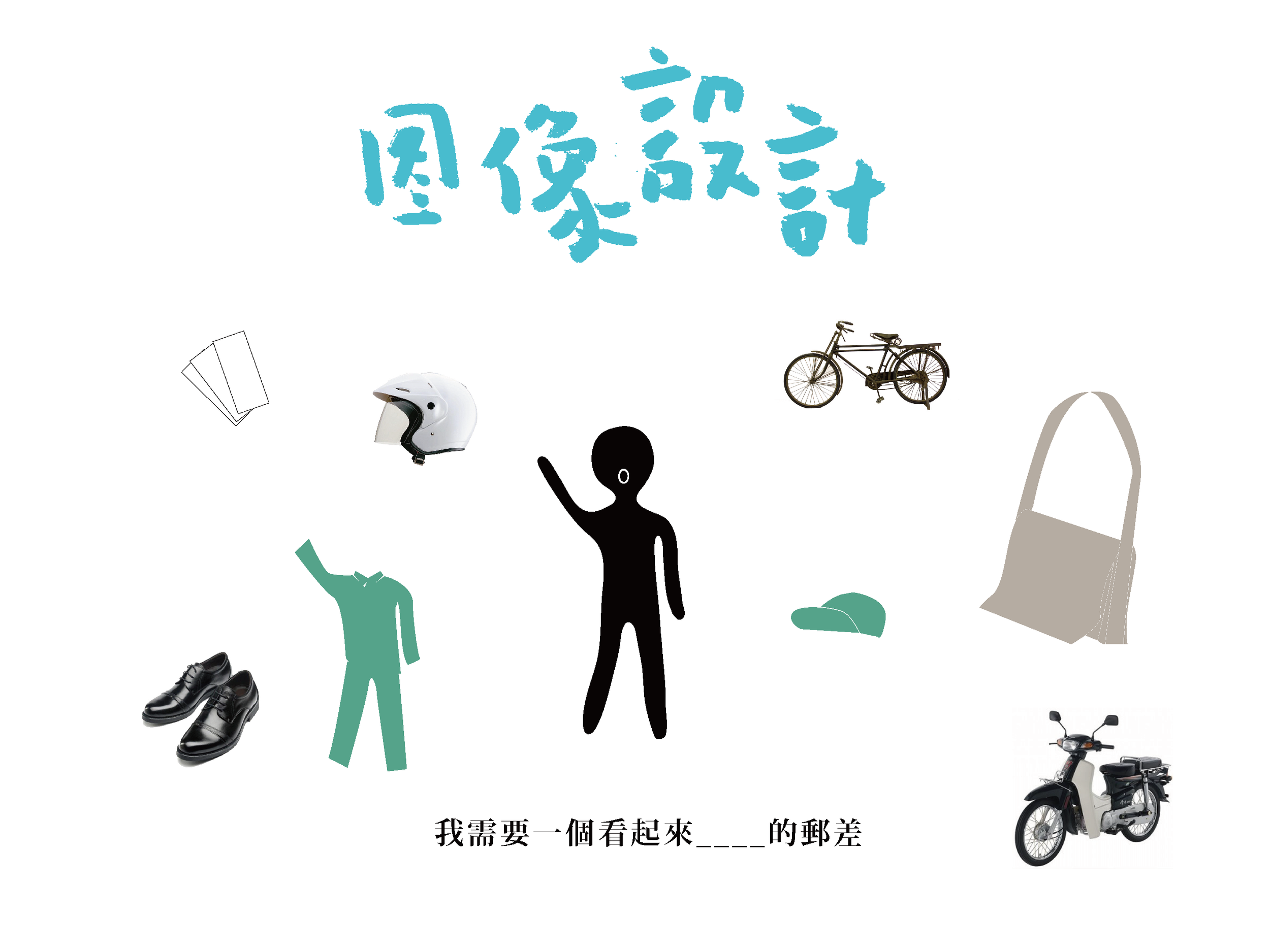
Artistry, in its most functional sense, addresses formal problems. Whether clothing is neatly tucked, whether a face is cleanly shaved, whether shoelaces are properly tied — these are clearly definable, fully executable tasks. Once completed, they are finished. No further interpretation is required. Graphic design goes a step further, employing the selection and arrangement of visual elements to construct a recognizable image for a given subject. What uniform a postal worker wears, what vehicle he rides, what bag he carries — these choices collectively define the visual identity of the "postal worker" as a figure. It answers the question of how something appears. Visual communication, by contrast, addresses a more fundamental proposition: what kind of person is this? What emotions arise in the observer upon encounter? It responds not to appearance, but to character and relationship.
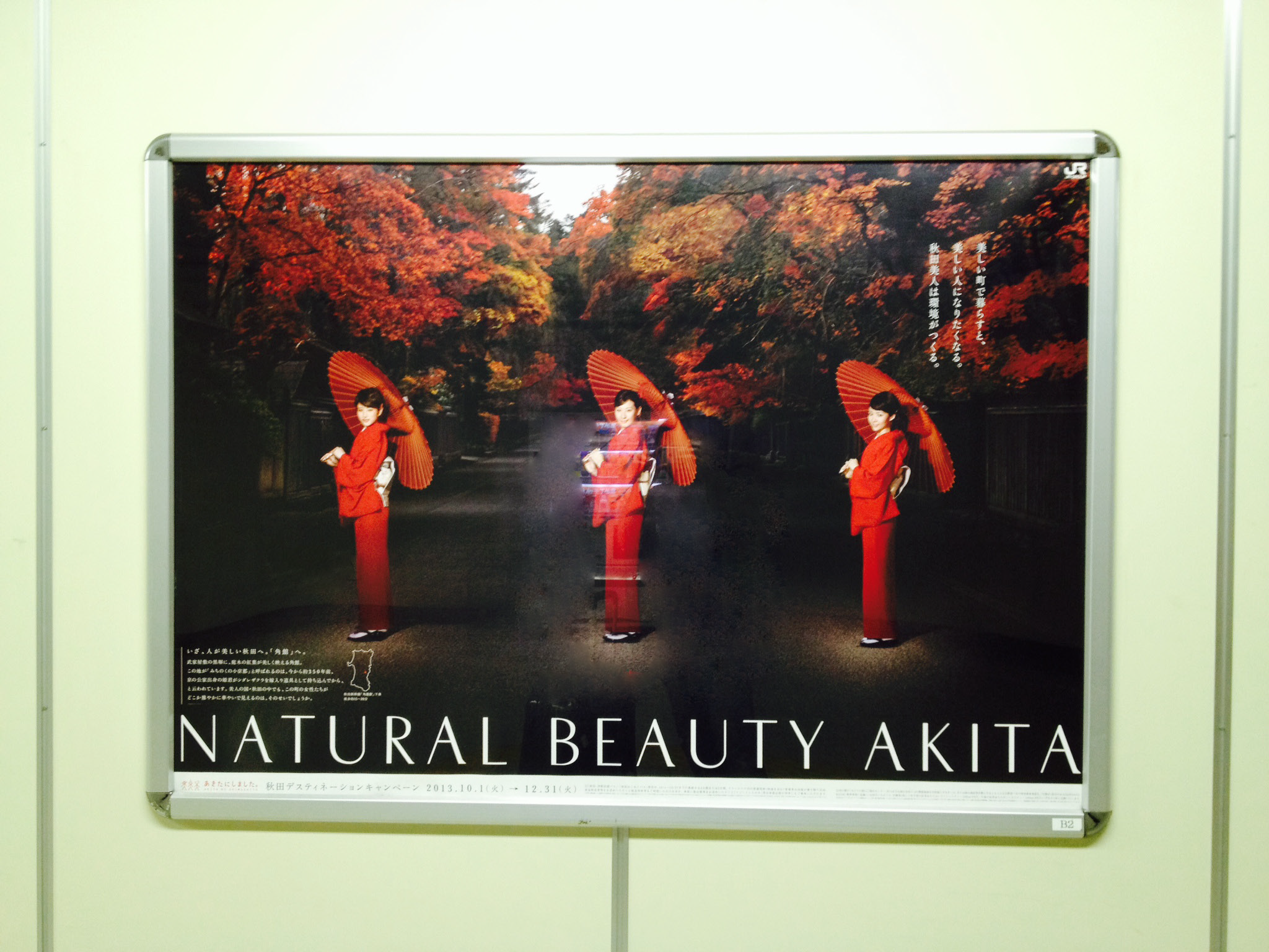
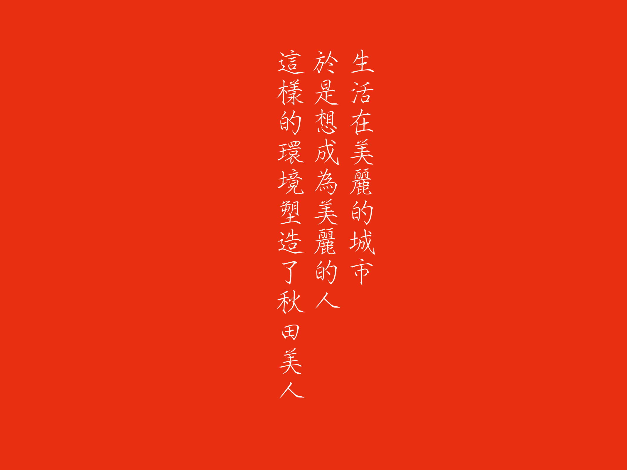
This distinction becomes clearer through a concrete example. A tourism campaign by JR East for Akita Prefecture carries the following copy: "Living in a beautiful city makes you want to become a beautiful person. The environment shapes the Akita beauty." The strategic intent of this campaign is not to promote tourist attractions or stimulate consumption. Rather, it personifies Akita Prefecture itself — introducing it as one would introduce a person, allowing the observer to sense its character and origins. What stirs within the observer is not a desire to consume, but an impulse to know. This is precisely the critical distinction between visual communication and graphic design.
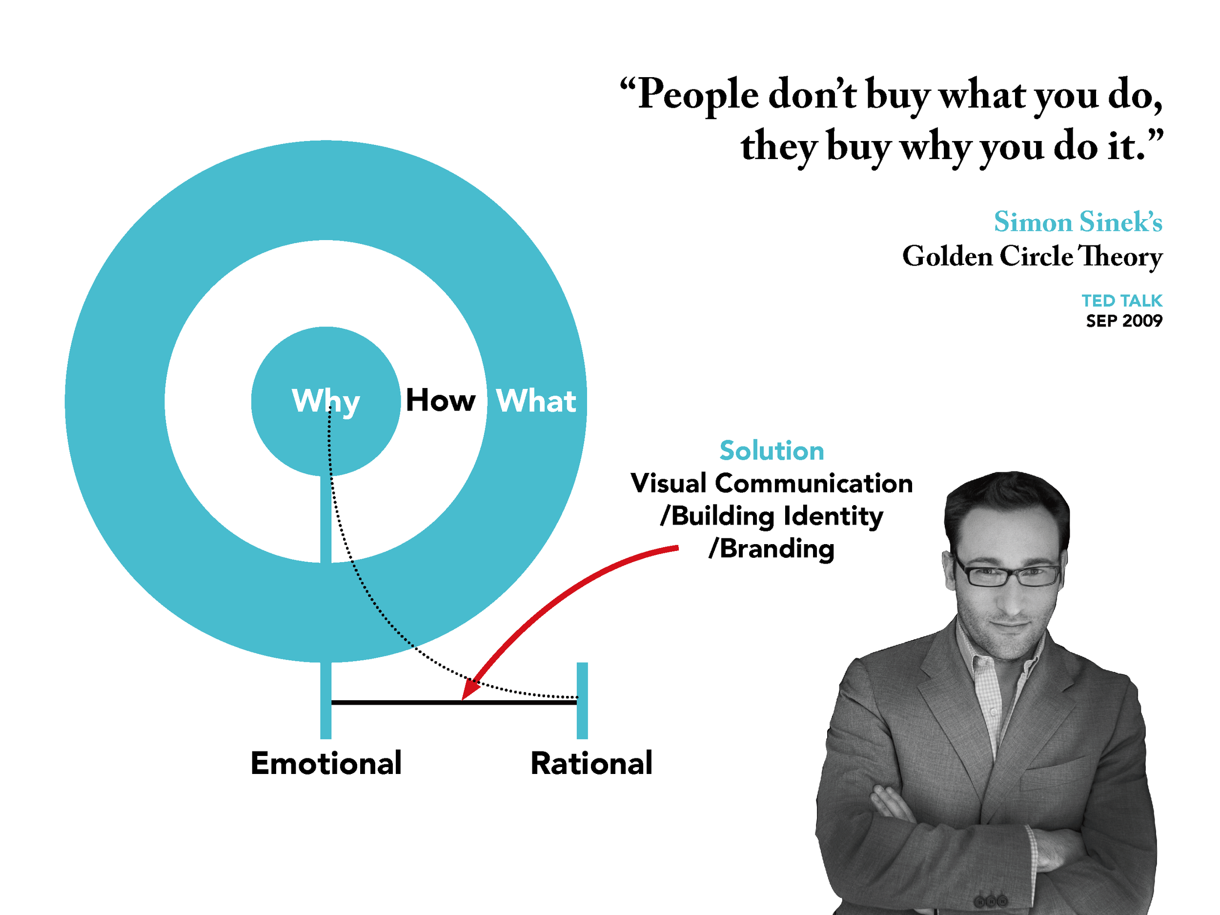
On the subject of emotional bonds between brands and their audiences, Simon Sinek articulated the essential logic in his 2009 TED Talk through the Golden Circle theory, summarizing it in a single sentence: "People don't buy what you do, they buy why you do it." Most organizations communicate from the outside in — first explaining what they do, then how they do it, and finally why. Yet the communications that truly generate resonance operate in exactly the opposite direction. The Why is the innermost layer; it carries emotion and connects belief. The role of visual communication is to translate this Why into perceptible visual language, allowing it to permeate outward so that both the What and the How bear the imprint of the same essential character.
Three projects serve as evidence.
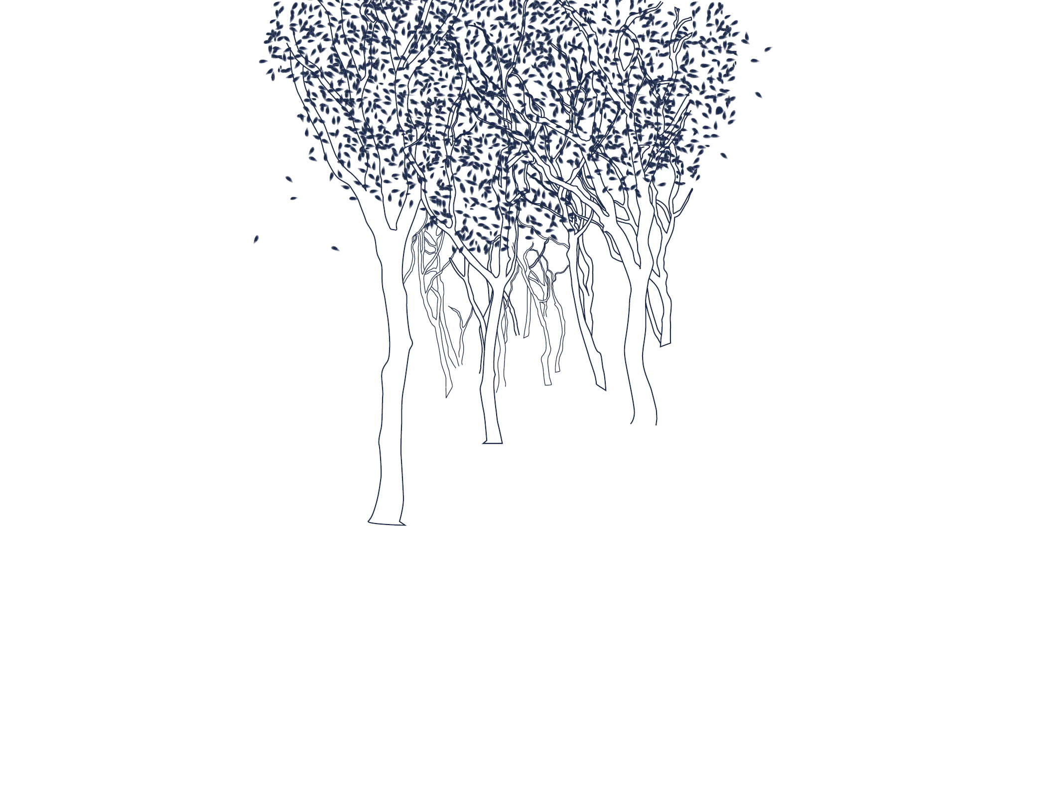
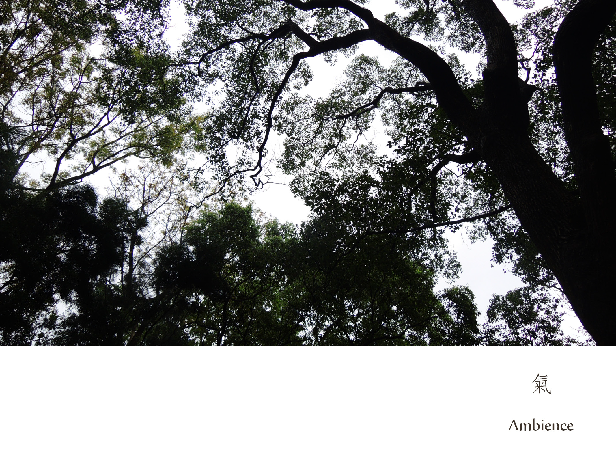
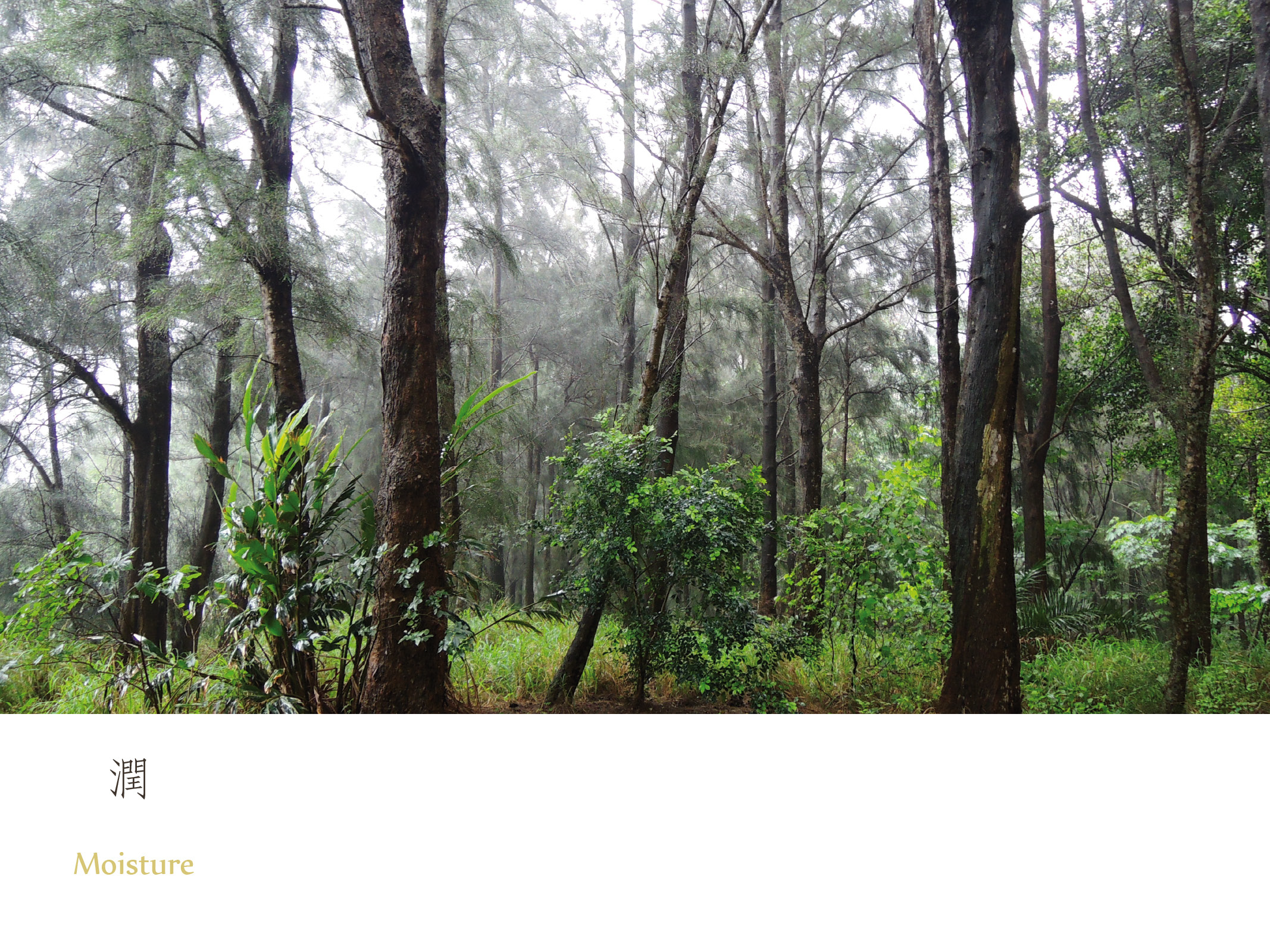
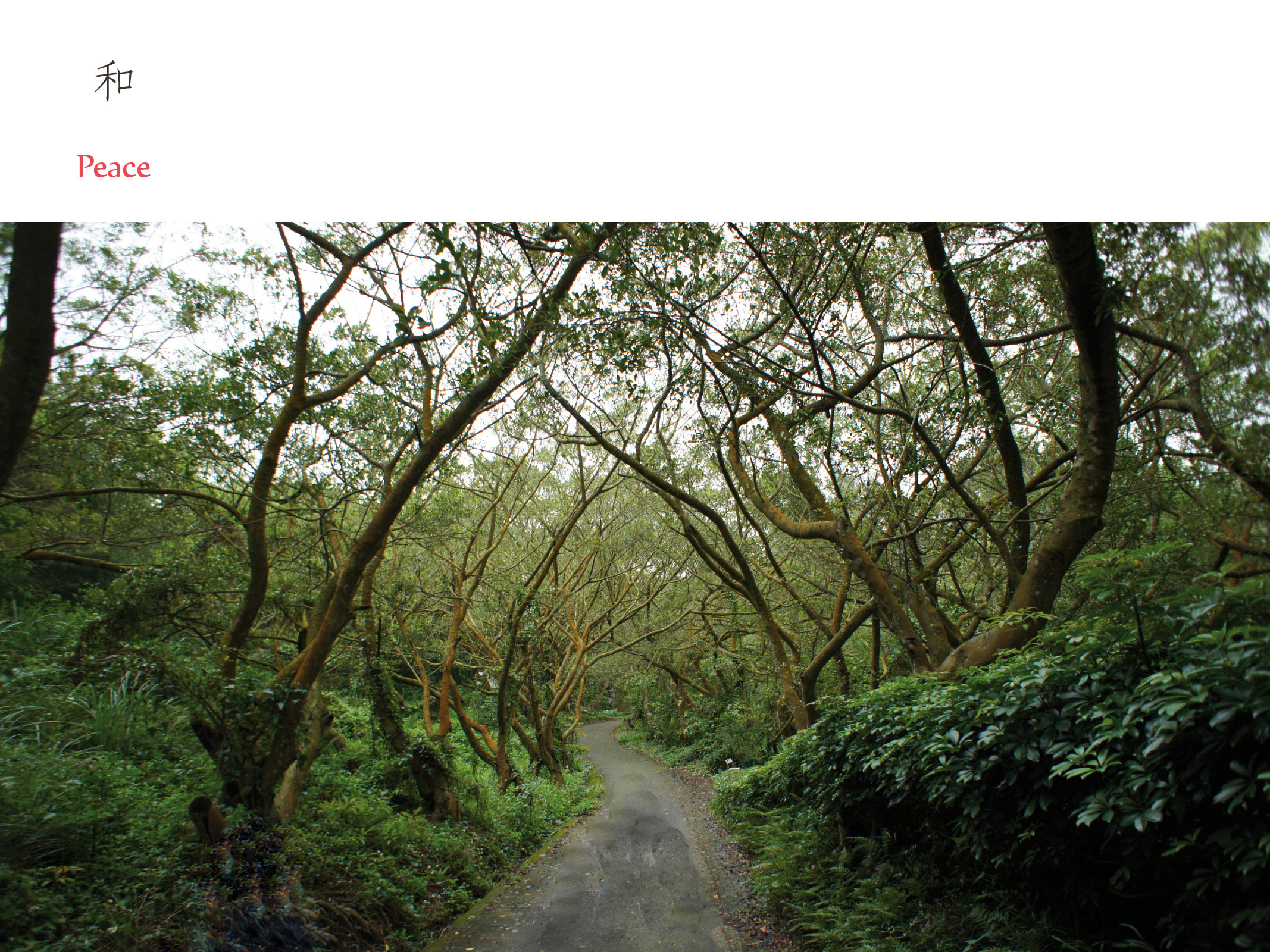
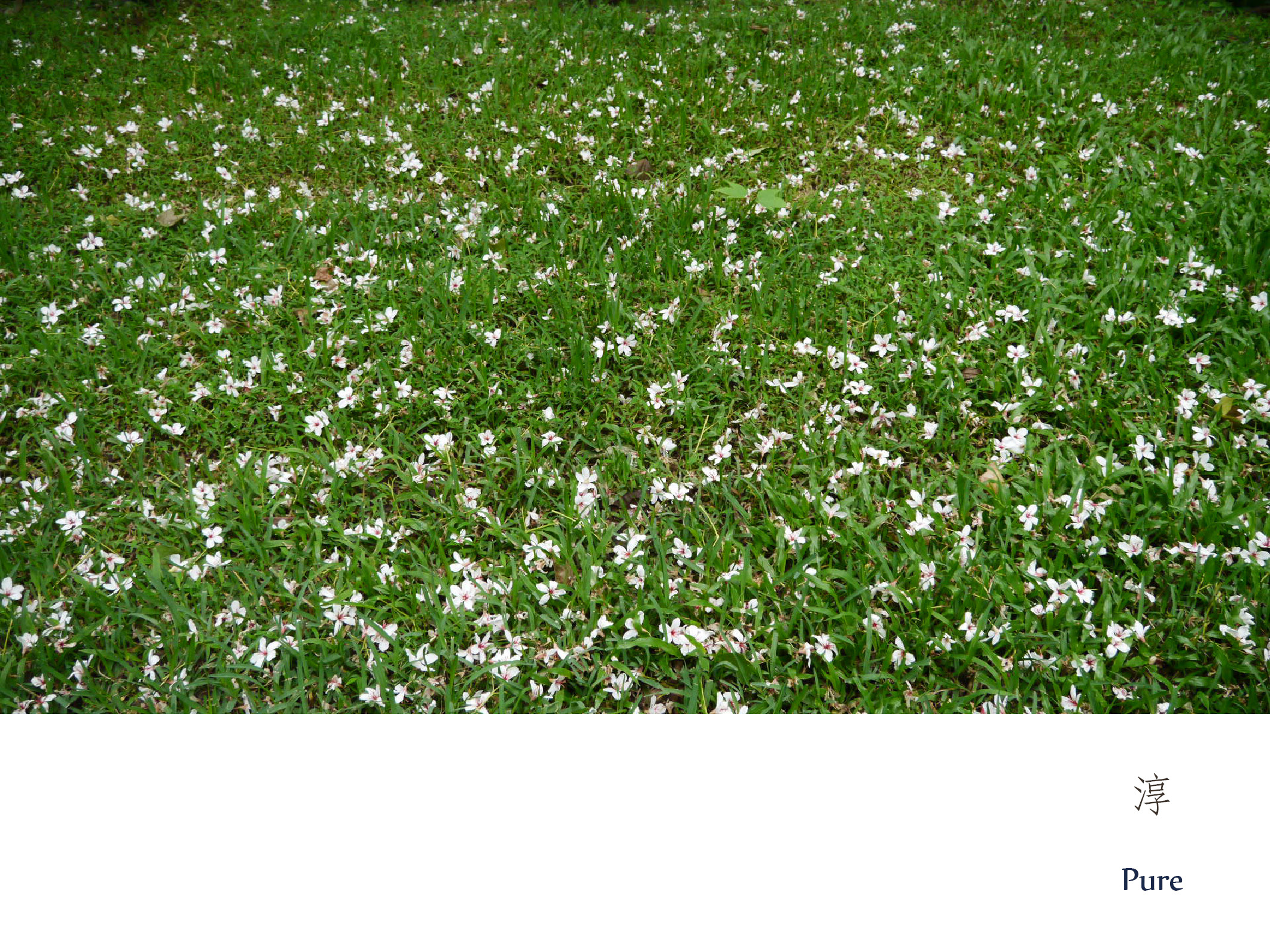
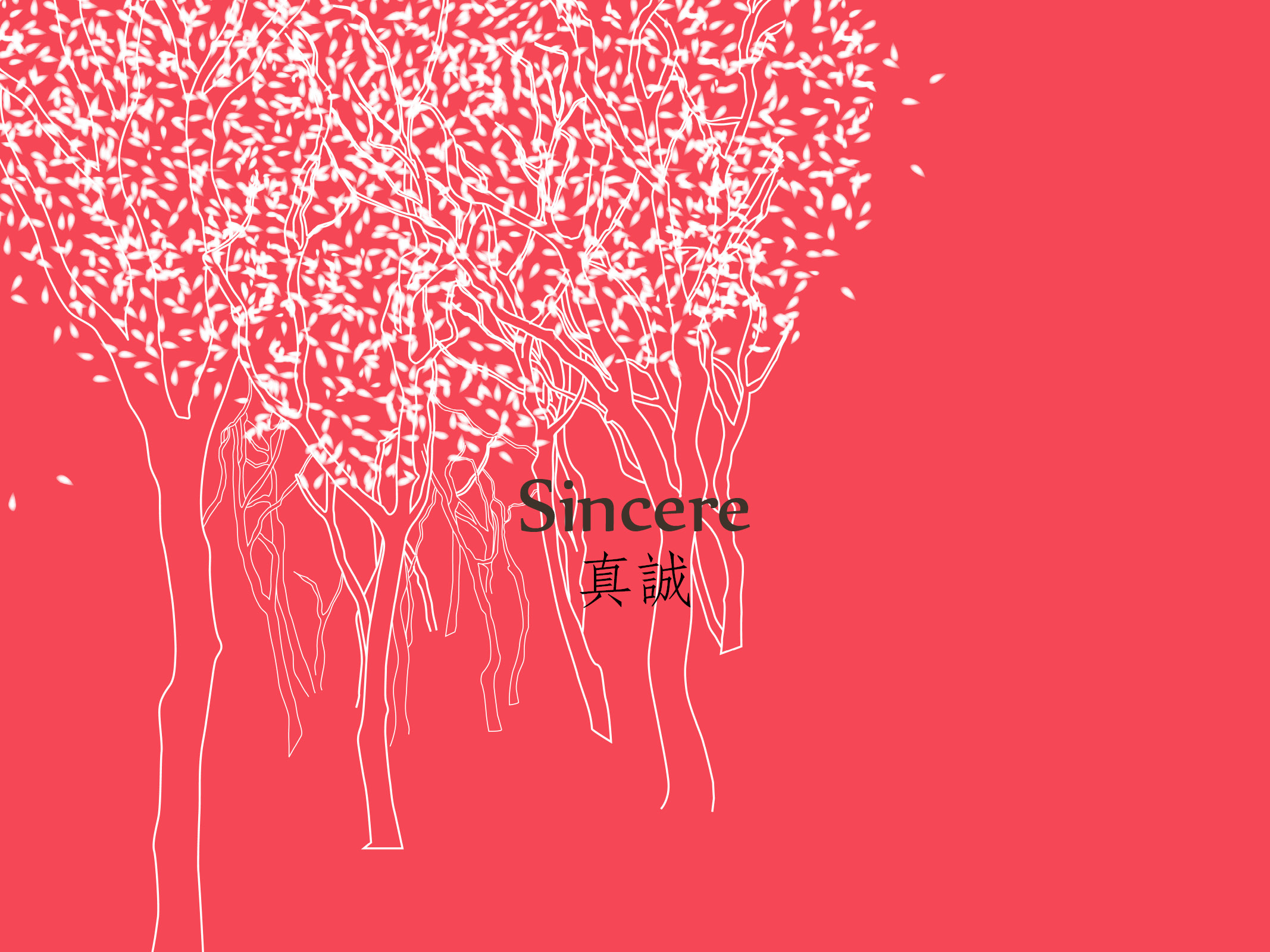
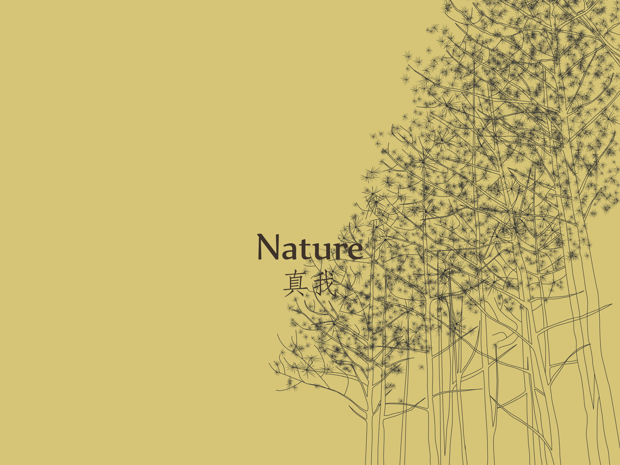
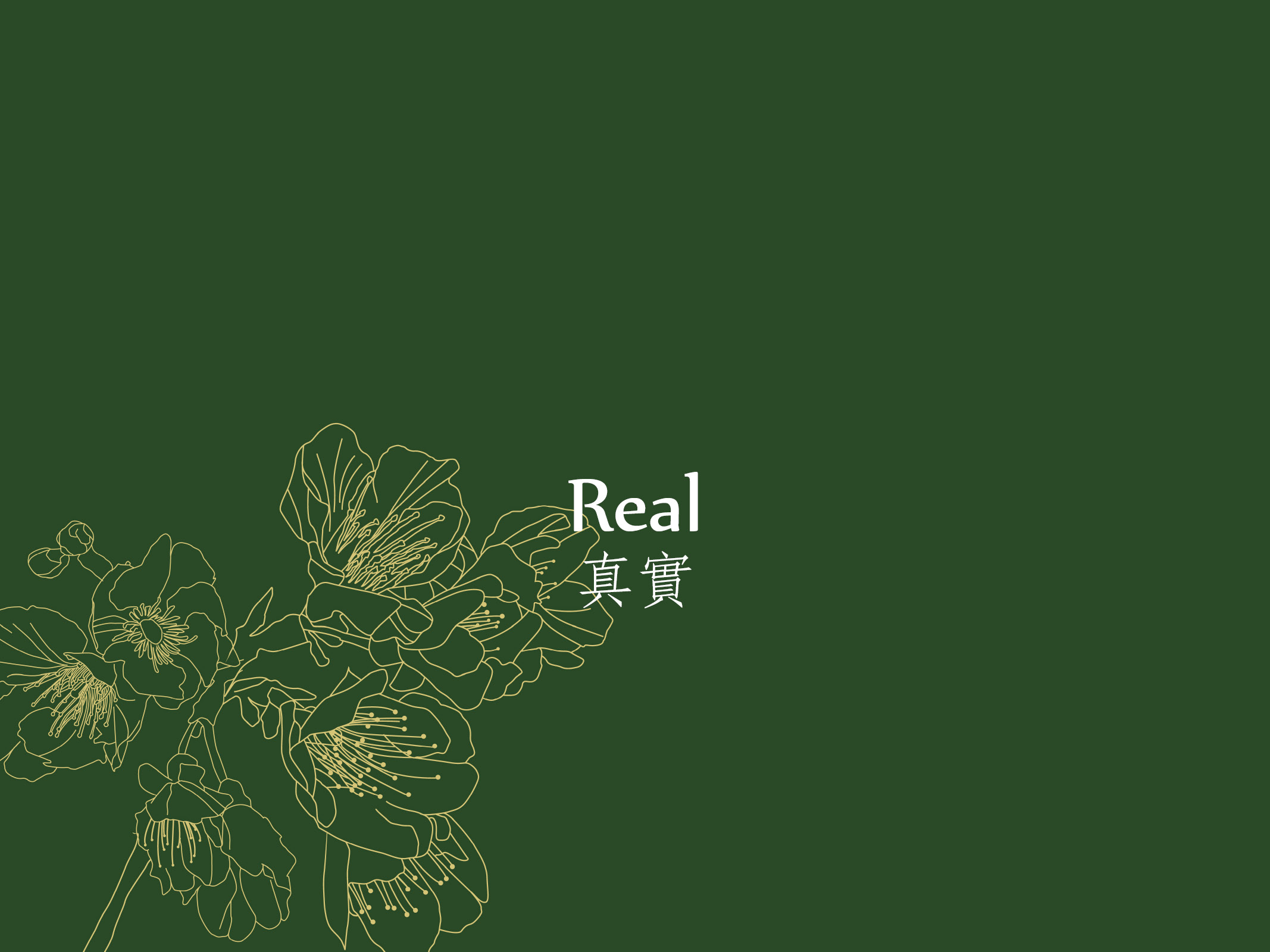
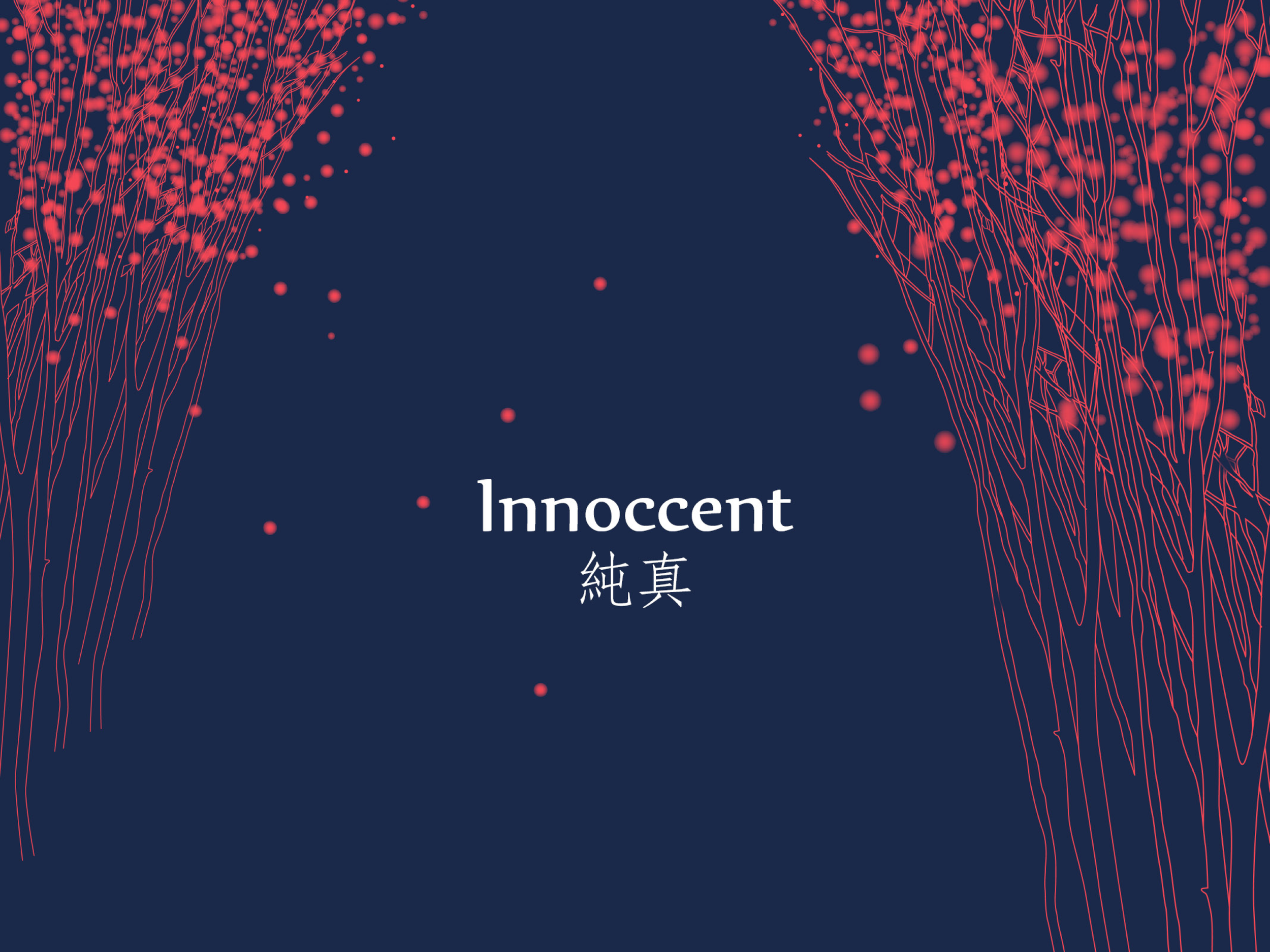
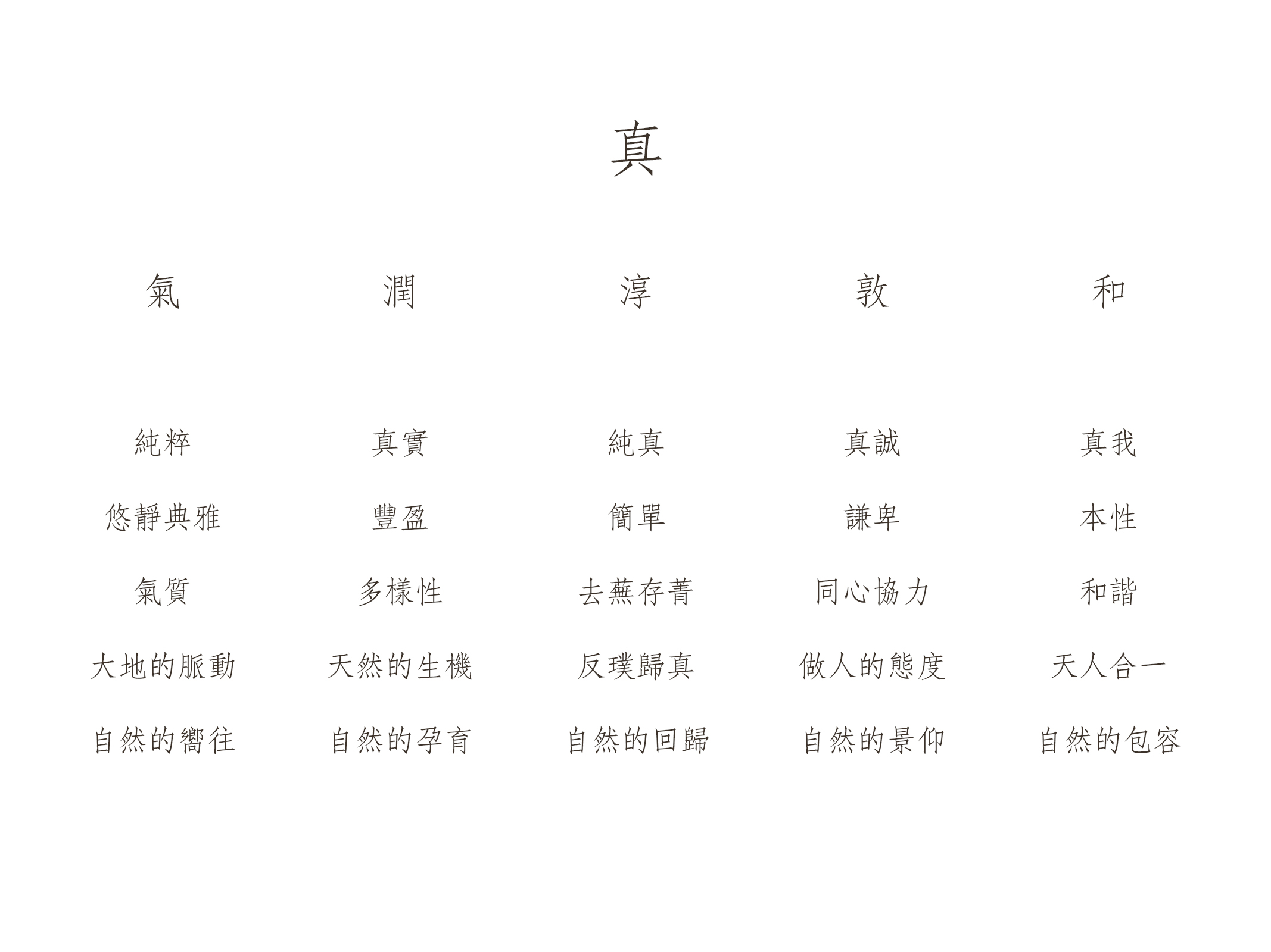
The first is the brand development for a resort in Miaoli, Taiwan. The design process began with the natural character of the site itself, distilling "Truth" (真) as the core concept, from which five dimensions were developed: Qi (the pulse of the earth), Moisture (natural vitality), Purity (a return to the essential), Humility (a way of being human), and Harmony (the unity of humanity and nature). Each dimension is paired with on-site photography and hand-drawn tree illustrations whose linework shifts in response to emotional tone — rendered in deep crimson for Sincerity, in warm gold for one's True Nature, in midnight blue for Innocence. The visual language flows continuously around different facets of a single character. These converged into the brand's core statement: "A Realm of Seeking Truth" (求真之境), with the character 真 itself — set in a sharply cut, custom typeface — serving as the primary visual identity, so that the letterform becomes the mark. The fundamental nature of this process was to pursue a single question: what is the reason for this place's existence in the world, and with whom does it wish to enter into a relationship?
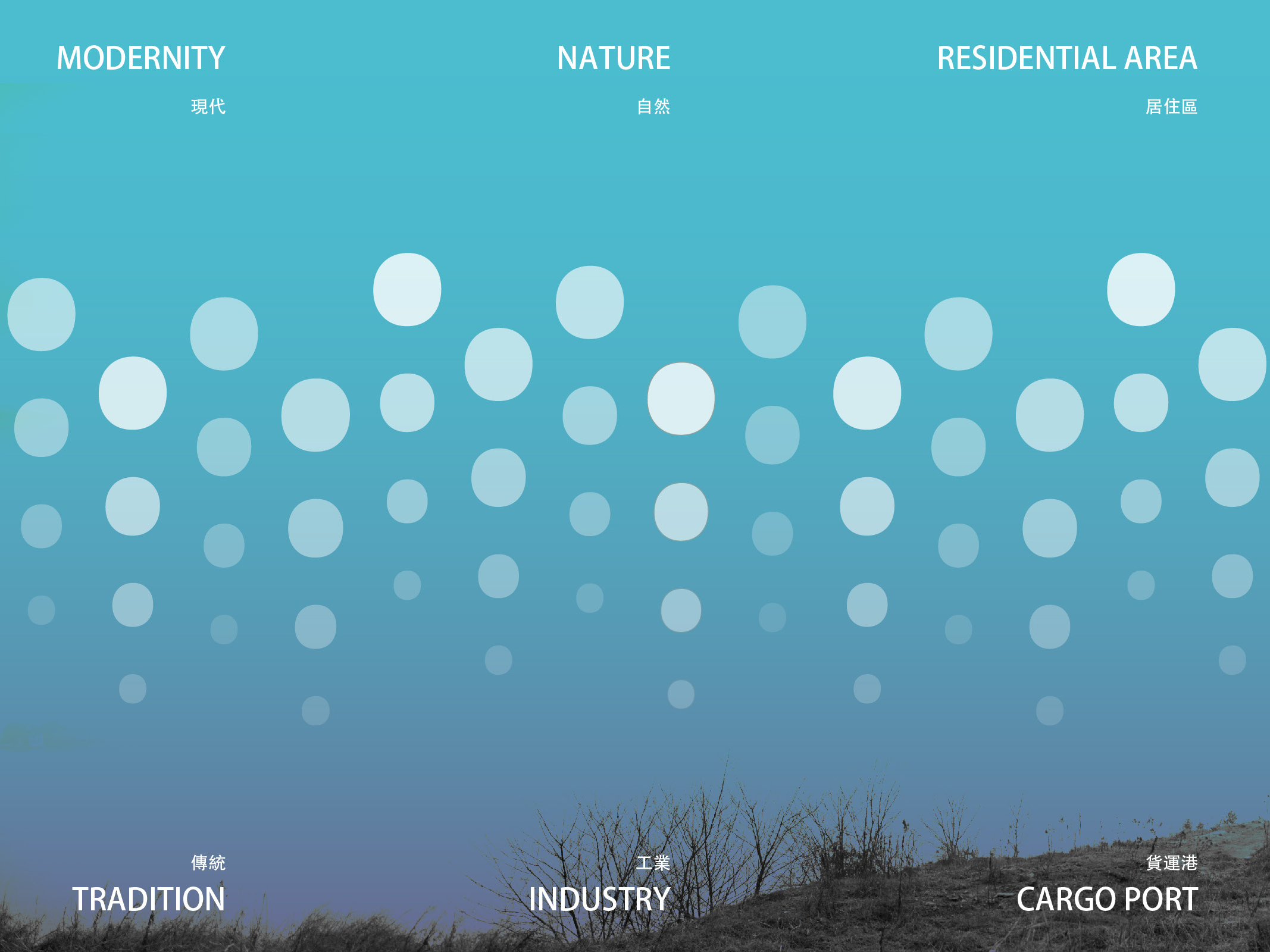
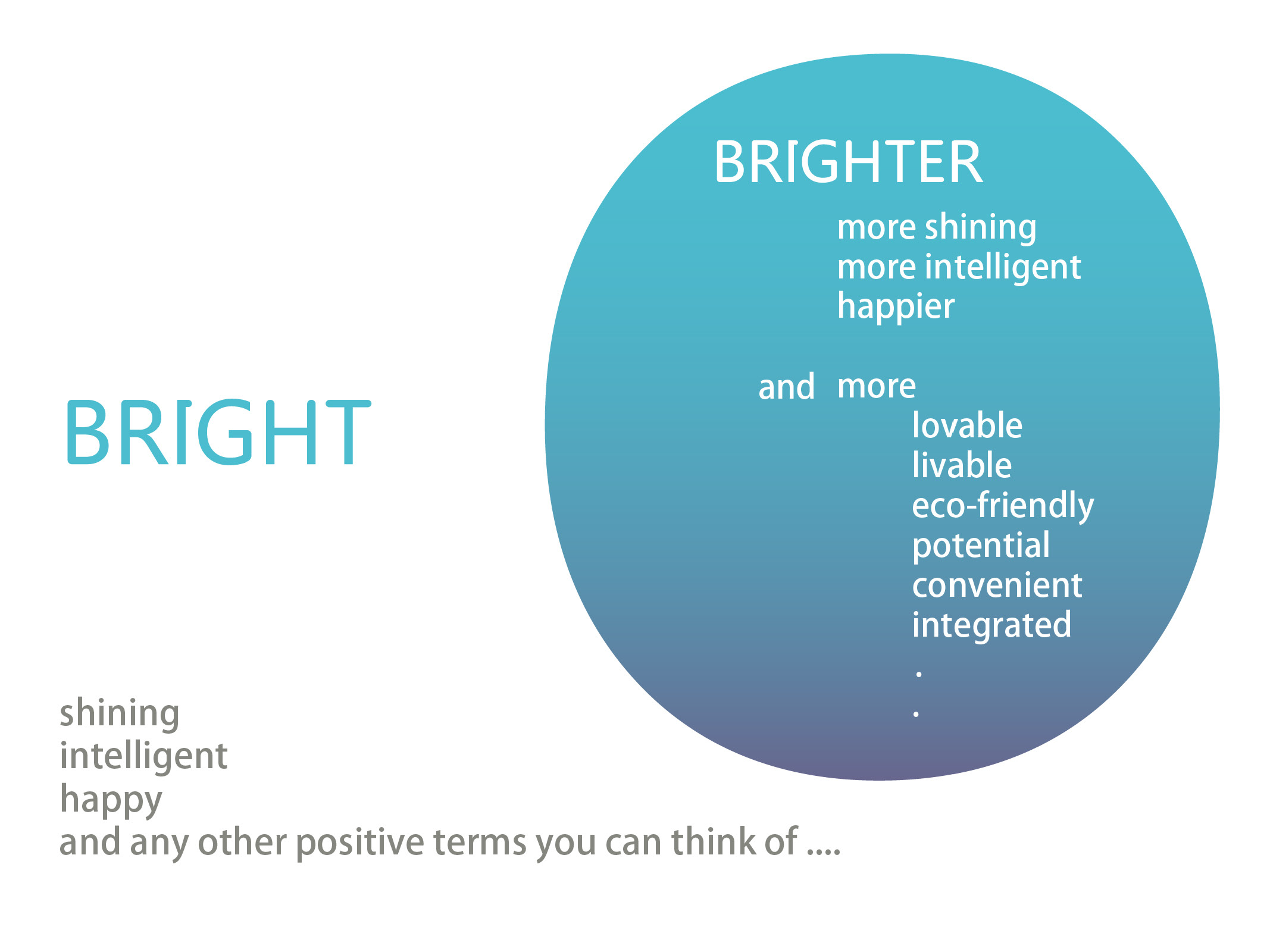
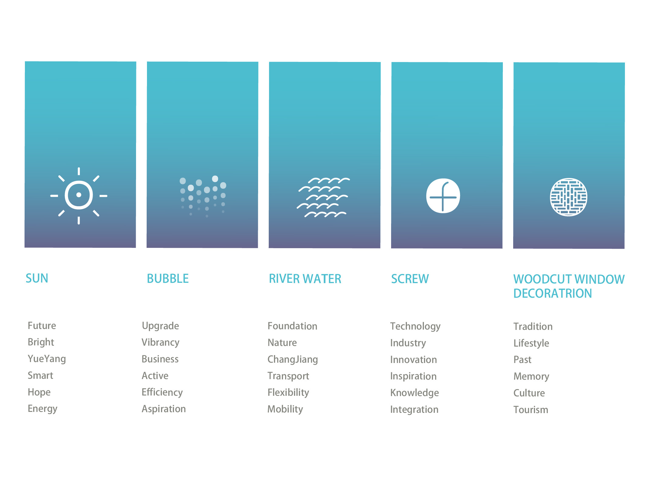
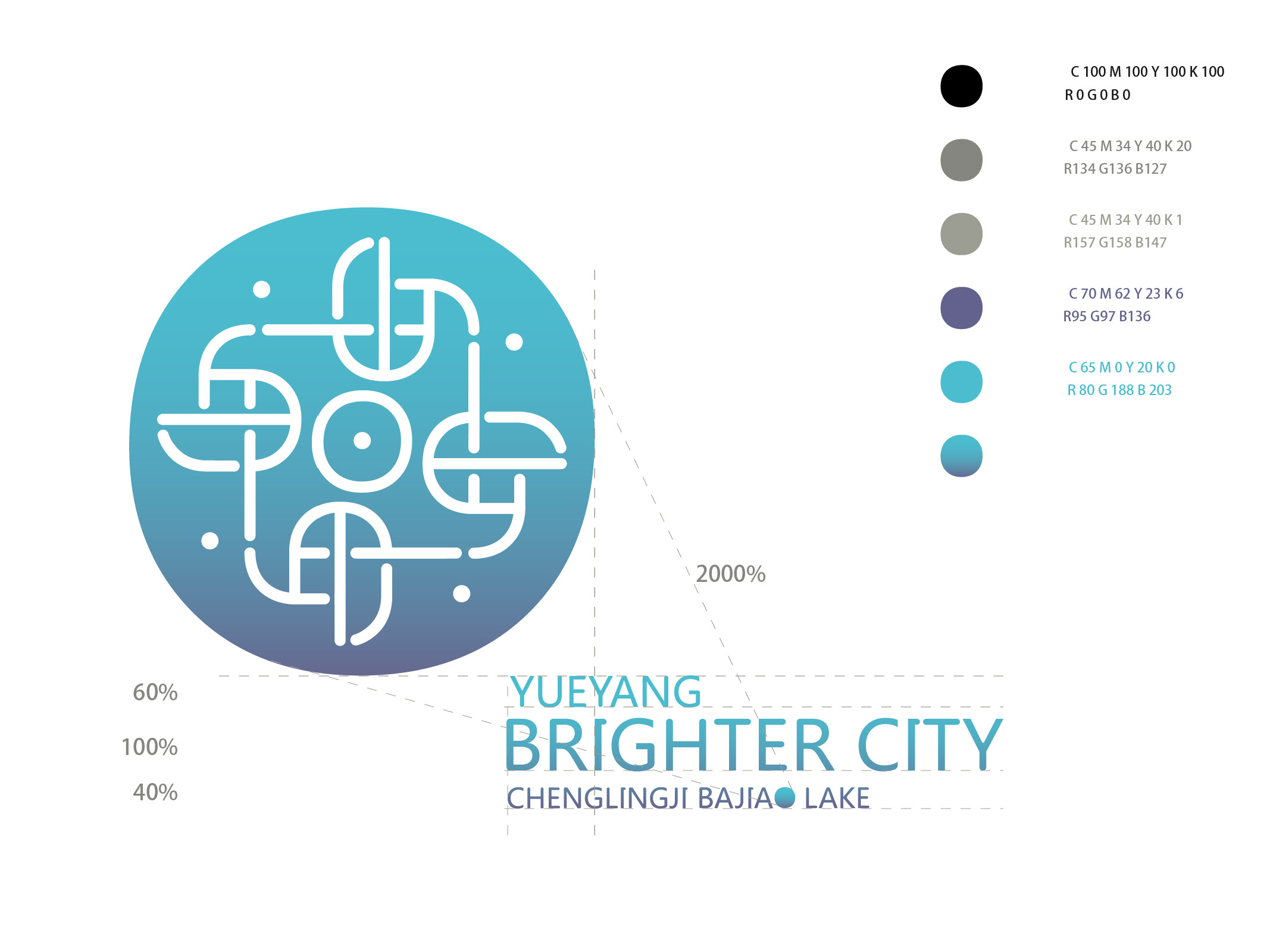
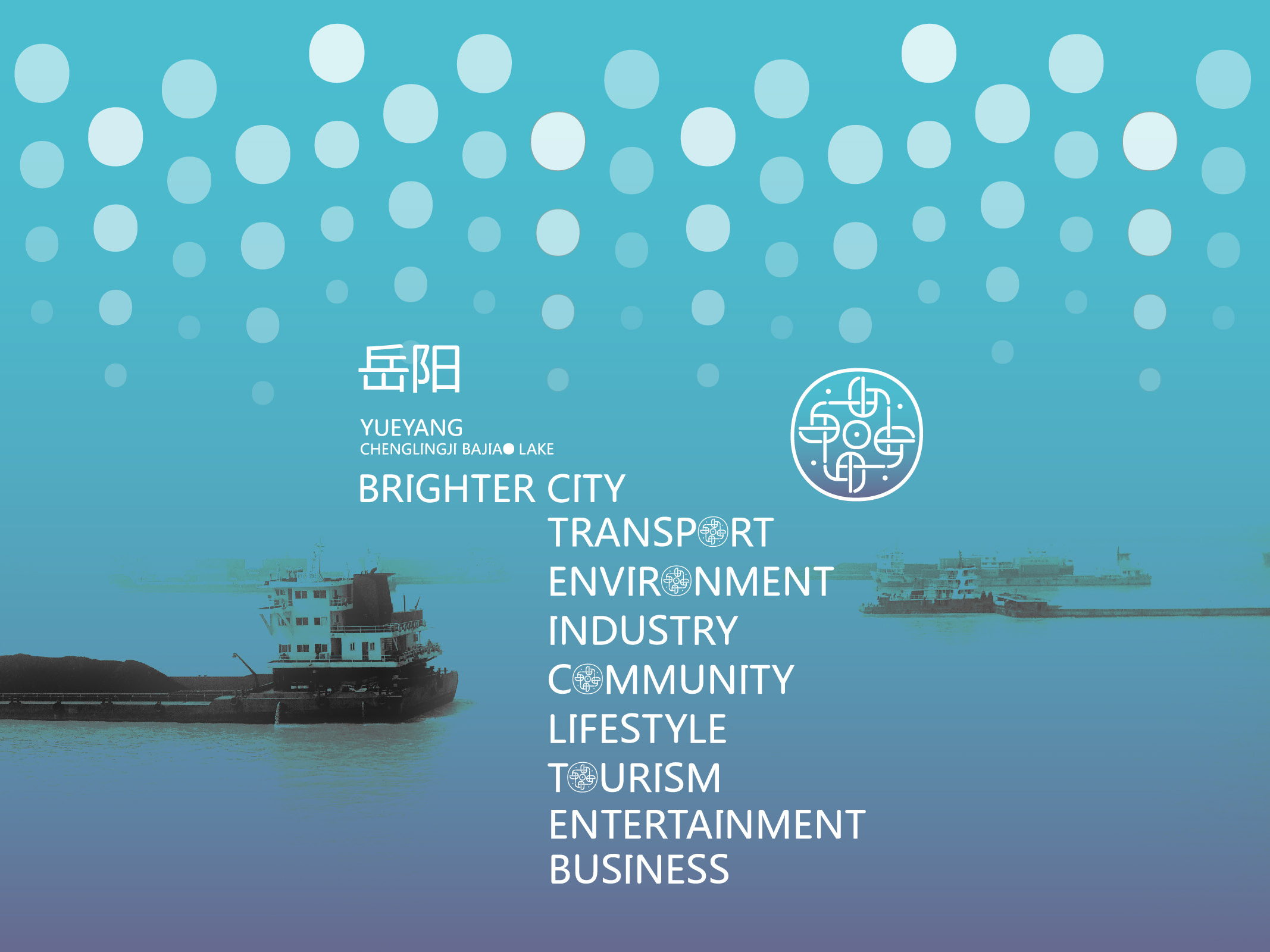
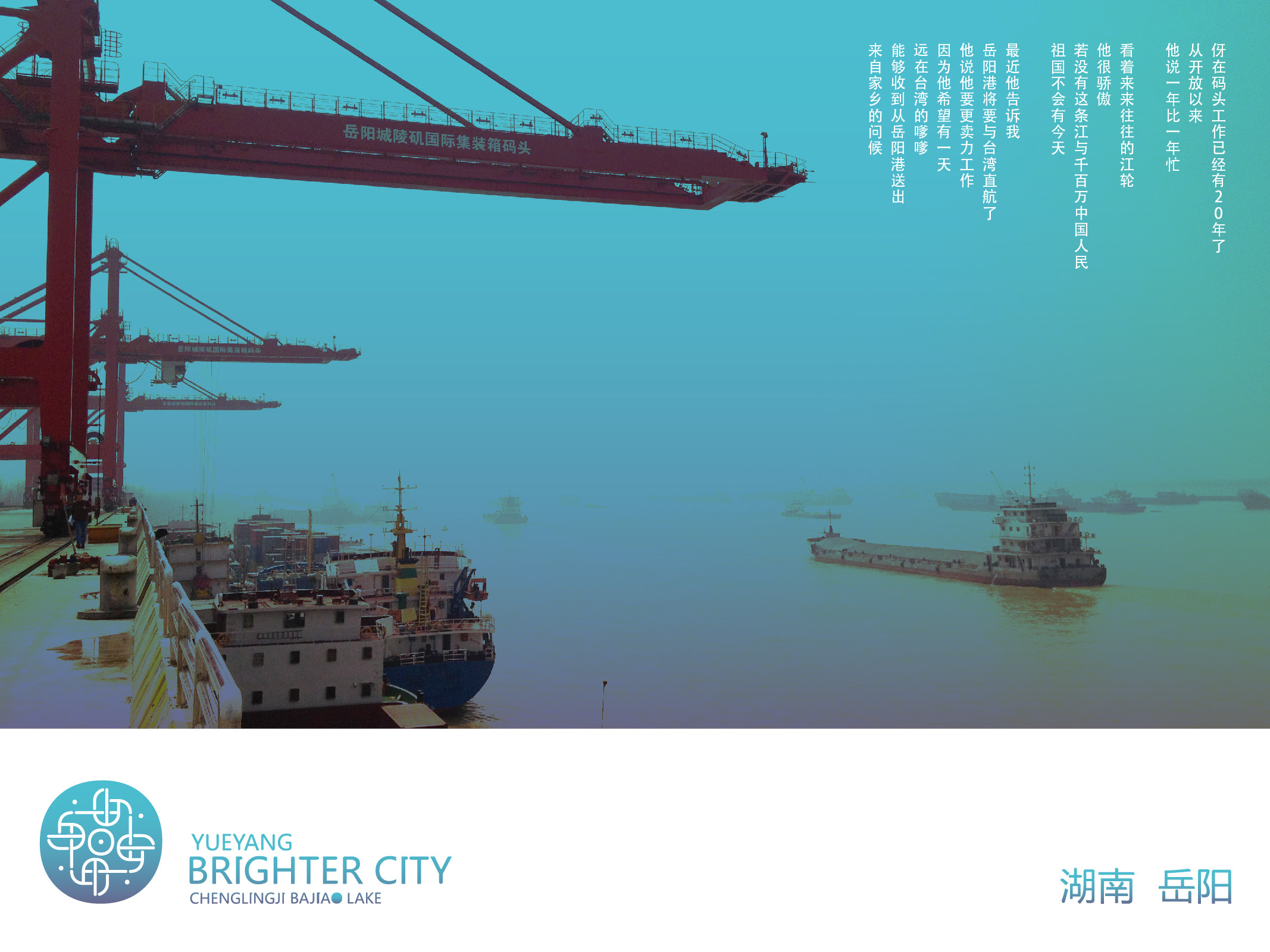
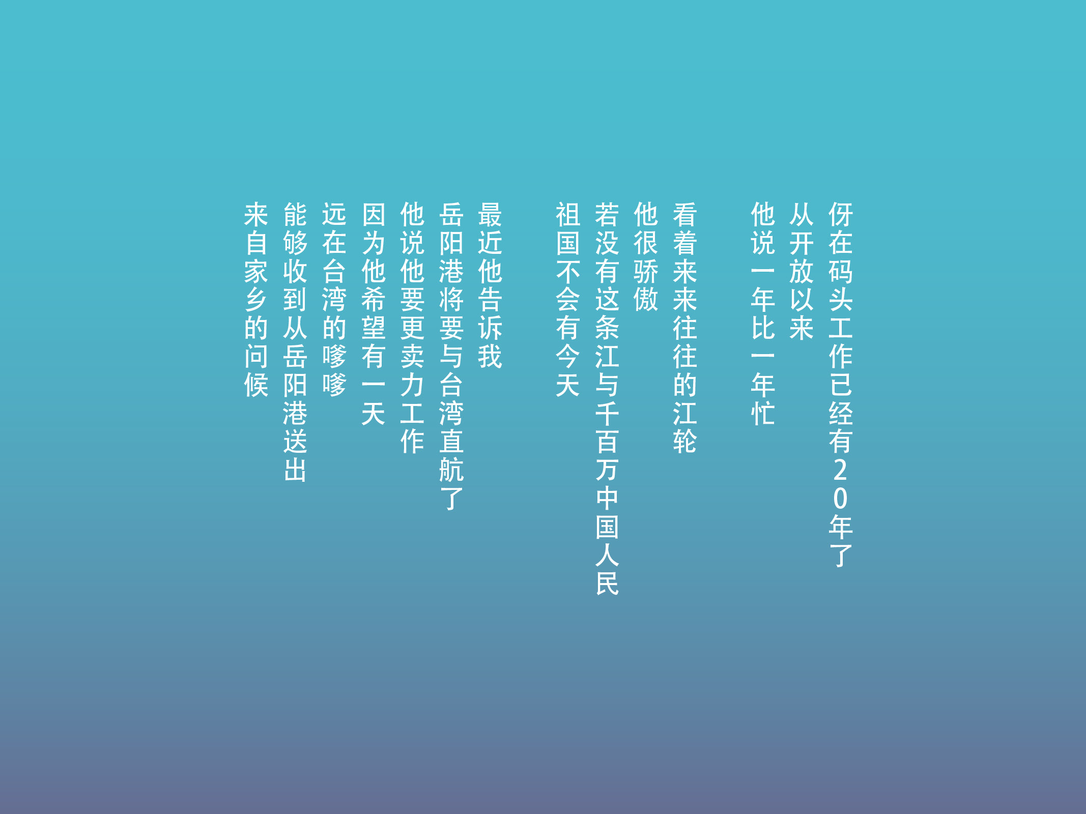
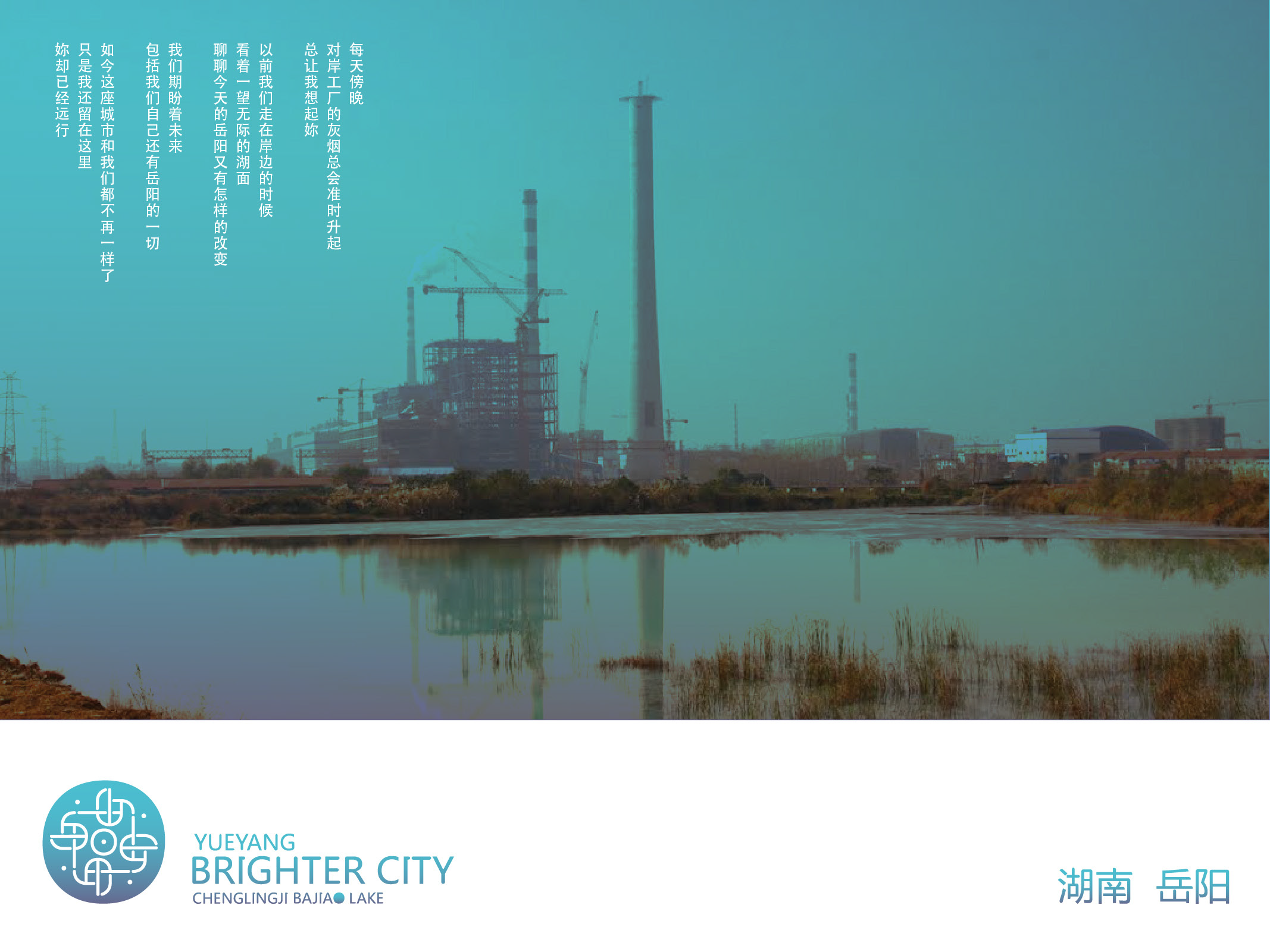
The second project is the city branding for Yueyang's Chenglingji Bajiao Lake district in Hunan, China — an industrial city in search of transformation. Rather than beginning with hard urban data, the designer chose to start from the stories of real people. In the course of research, a dock worker who had spent twenty years at the port said: "Yueyang Port is about to open direct shipping routes to Taiwan. I want to work harder, so that one day I can send my hometown's greetings out from here." This became the emotional foundation of the brand "Yueyang Brighter City." The visual system grew from this foundation: five graphic elements — the sun, bubbles, river water, a screw, and a woodcut window lattice — correspond respectively to the city's future, vitality, natural heritage, industrial identity, and cultural memory. The primary color palette runs as a gradient from teal to deep violet-blue, serving as visual testimony to the city's gradual transition from heavy industry toward livability. Color here is not decoration; it is a record of the city's evolving character.
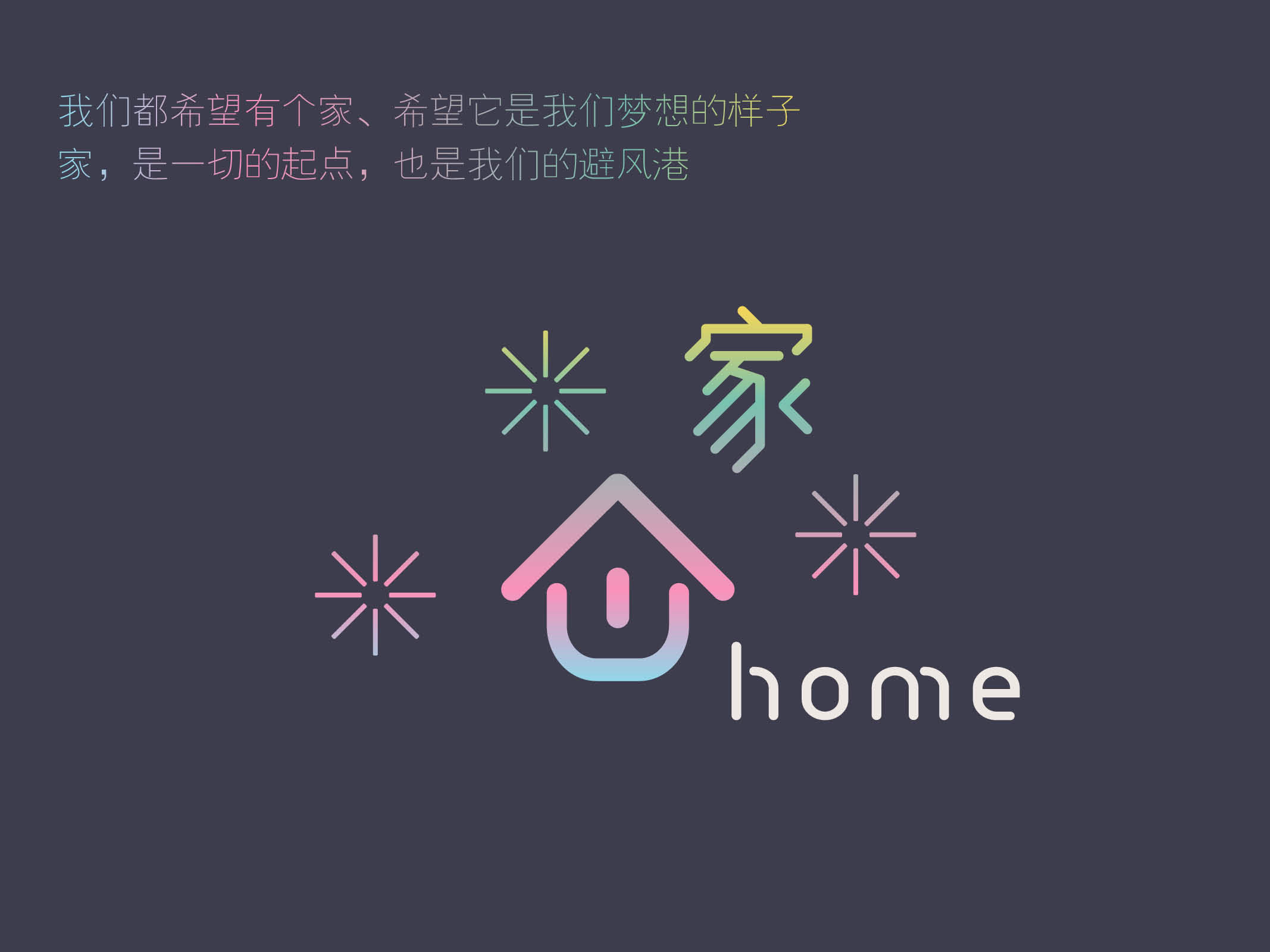
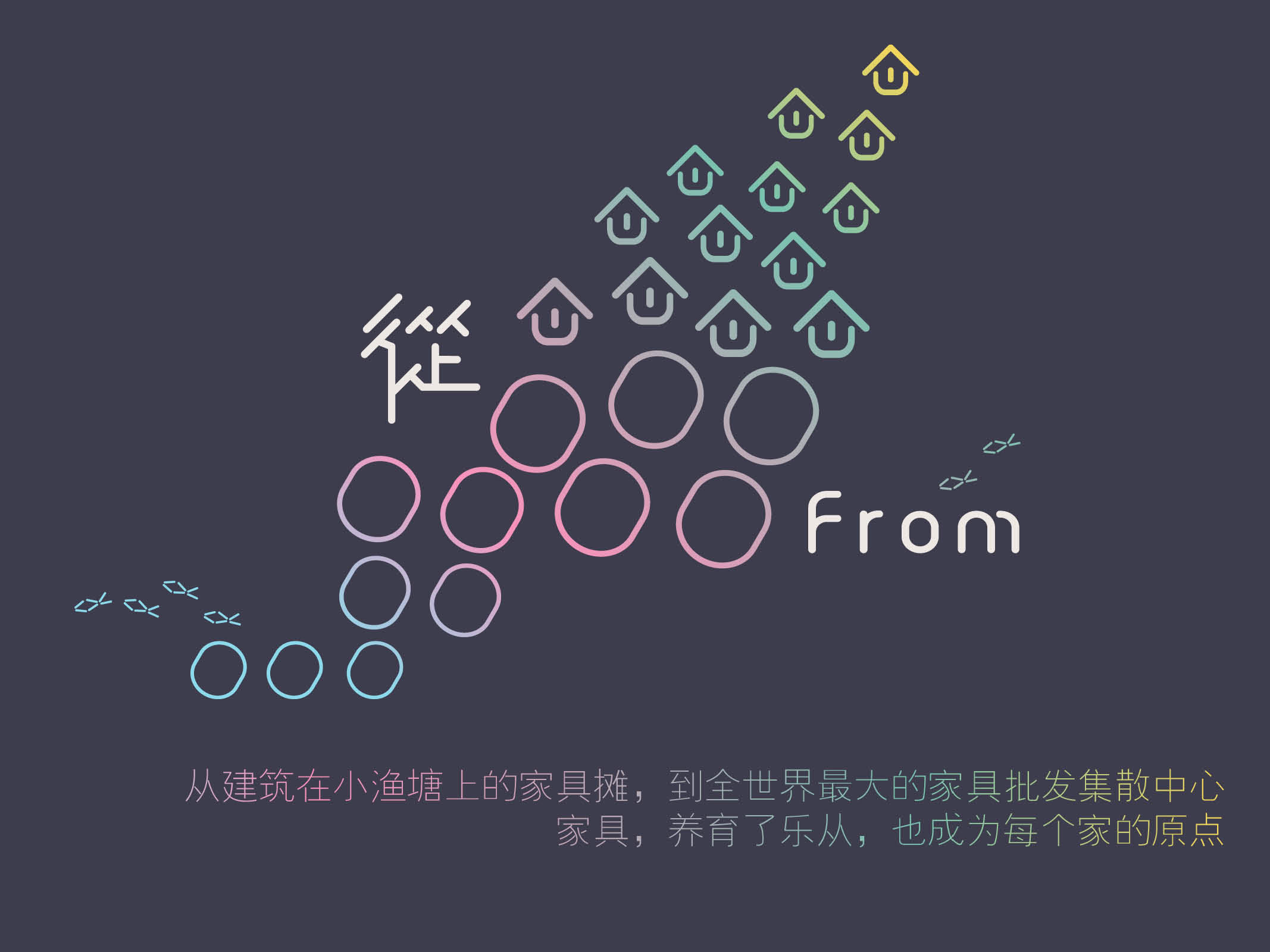
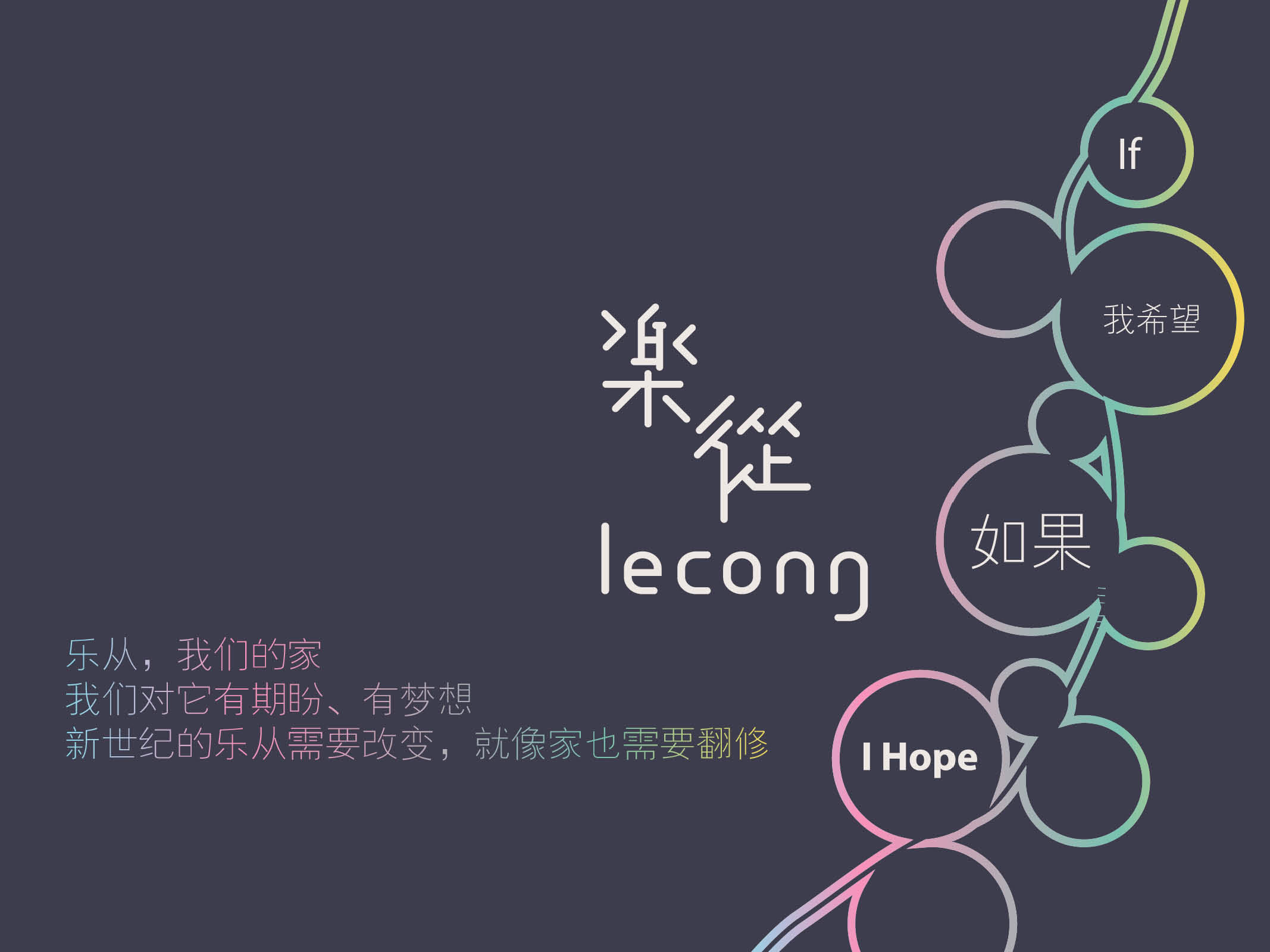
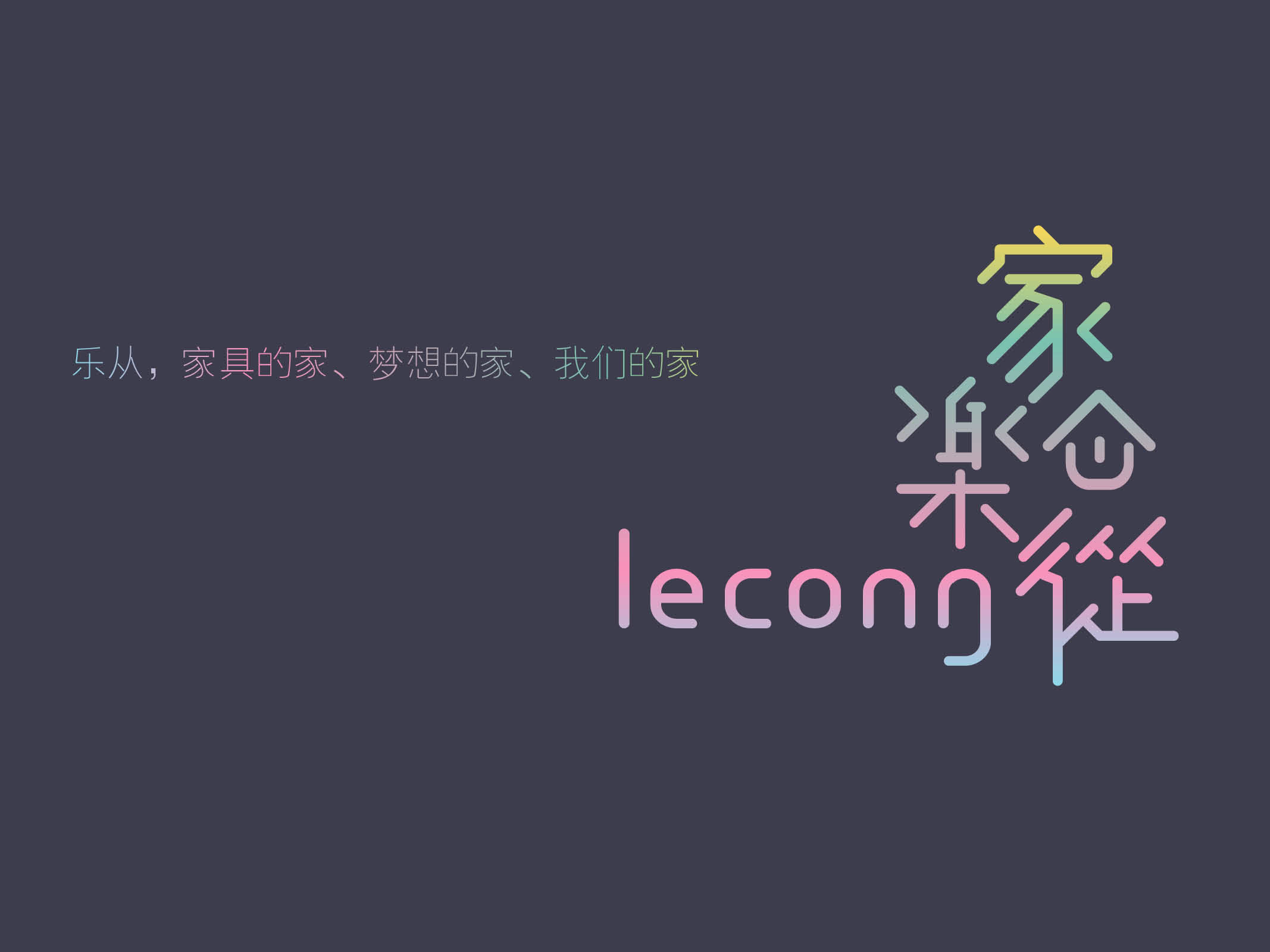
The third project is the brand renewal of Lecong Furniture Avenue in Foshan, Guangdong — a place that grew from a cluster of furniture stalls beside a small fishpond into the world's largest furniture wholesale distribution center. The core insight the designer identified was this: furniture is not merely merchandise; it is the origin of home. From this, the brand was positioned as "Home · Lecong — the home of furniture." The logo fuses a roofline with a smiling face: the U-form functions simultaneously as the body of a house and as an expression of joy, encoding both space and emotion within the simplest possible geometry. The color system employs soft multi-hued gradients, and the phrase "welcome home" serves as a unified emotional tone across every touchpoint — from business cards and street signage to light rail liveries and delivery trucks.
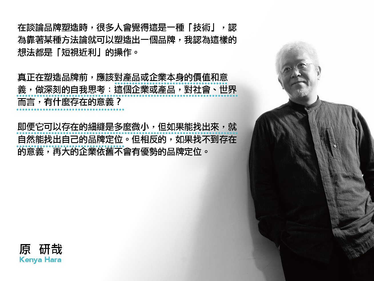
The designer Kenya Hara has spoken to this point with precision: "When people discuss brand building, they often treat it as a kind of 'technique,' believing that a brand can be constructed through some methodology. I regard such thinking as shortsighted. Before shaping a brand, one must engage in deep self-reflection on the value and meaning of the product or enterprise itself — what is its reason for existing, for society, for the world? Even if the space in which it can exist is extremely small, finding it will naturally reveal the brand's position. Conversely, if no reason for existence can be found, even the largest enterprise will fail to achieve a meaningful brand position." The three projects above are a practical demonstration of this proposition.
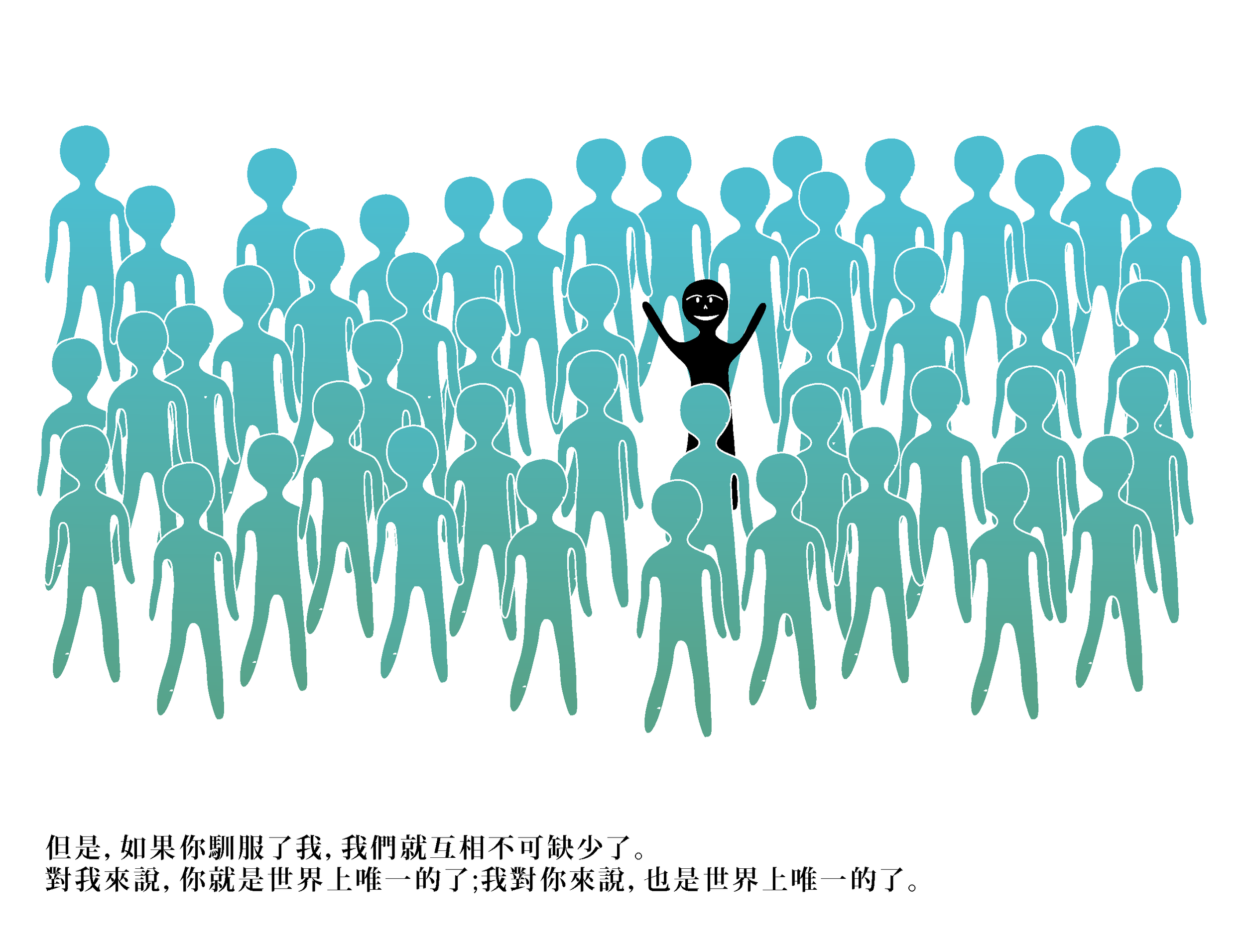
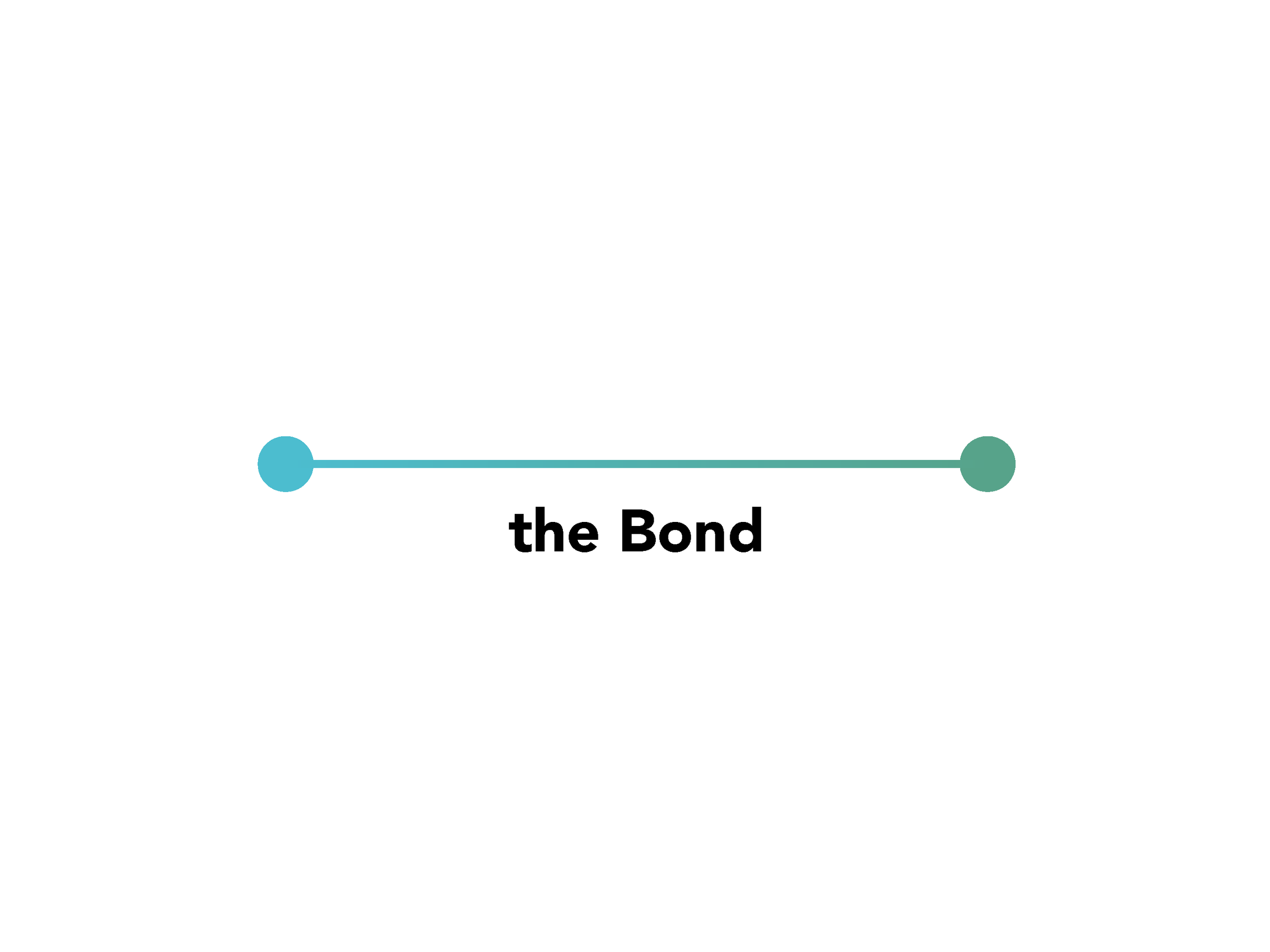
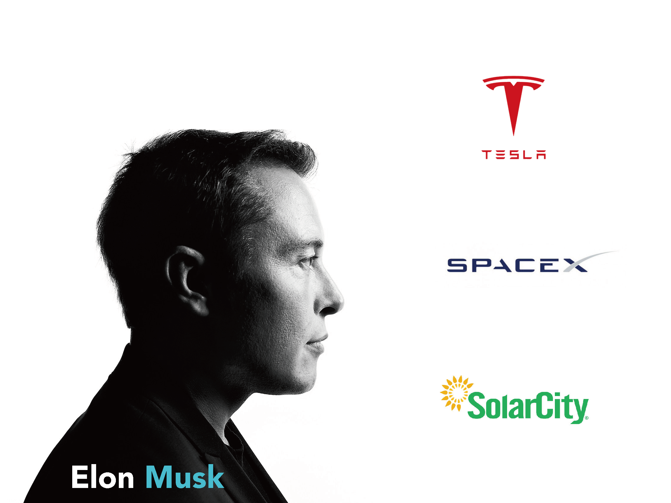
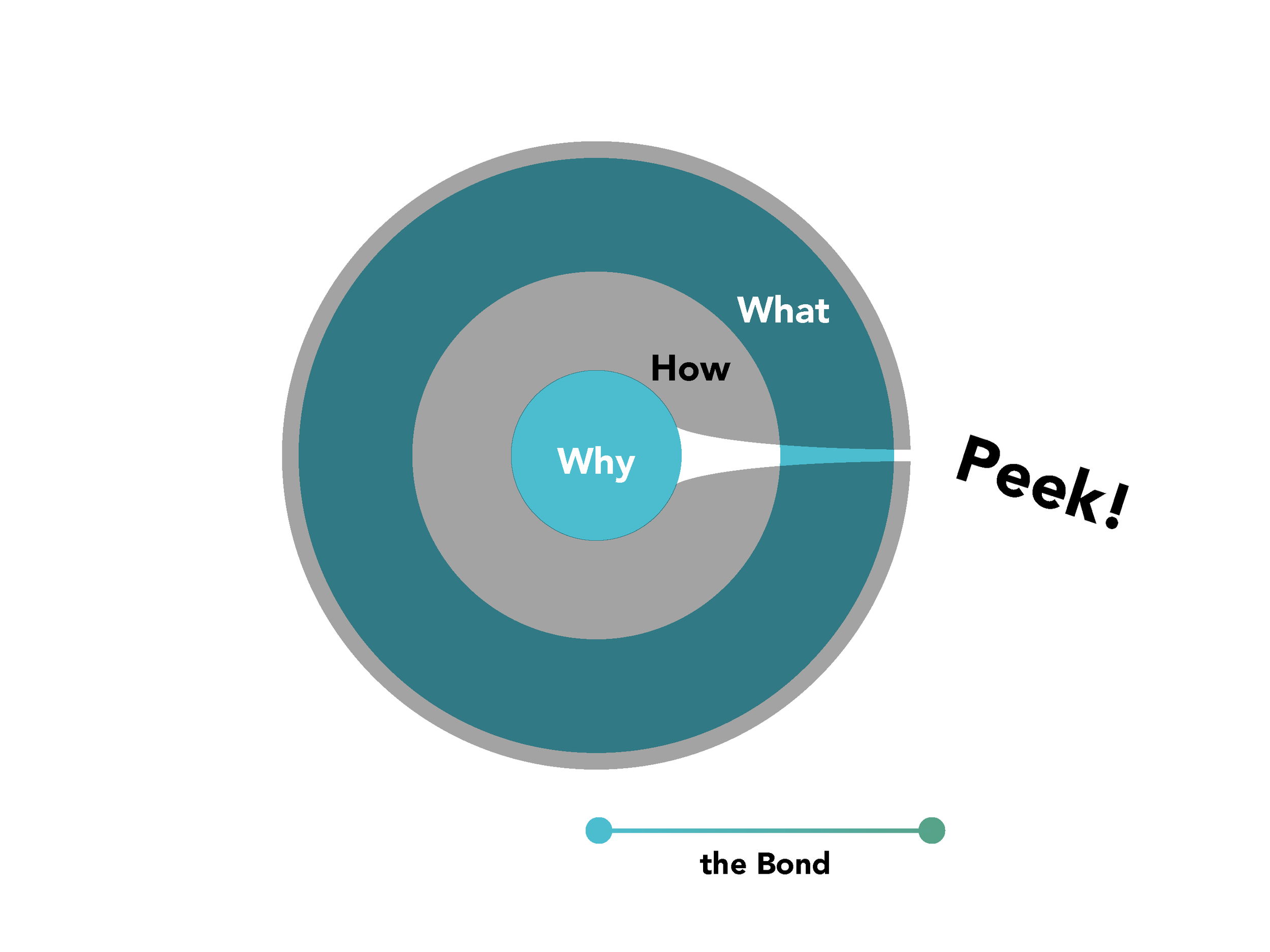
Carrying this logic to its furthest conclusion, Elon Musk may be the most illuminating contemporary example. Tesla, SpaceX, and SolarCity operate across electric vehicles, aerospace, and renewable energy — three fields that appear entirely unrelated on the surface. Yet once one understands Musk's Why — accelerating humanity's transition to sustainable energy and securing the multi-planetary survival of civilization — the internal coherence of all three ventures becomes evident. His Why is sufficiently clear to permeate everything he touches. People do not buy a Tesla simply because it is a superior electric vehicle; they buy it because they believe in what Musk believes. This is the moment the Why peeks out from the core of the Golden Circle — and the moment the Bond is formed.
In summary, the essence of visual communication lies not in making things appear more appealing, but in helping a brand discover and articulate the reason for its existence, and in cultivating between that brand and certain individuals a connection that is genuine and irreplaceable. Form serves meaning; meaning generates relationship; and relationship constitutes the deepest value a brand can hold.